Week 08 Progress
Feedback Summary
-Great work on the FX.
-Shot 01 add atmospheric details.
-Shot 06 matte painting looks a little flat.
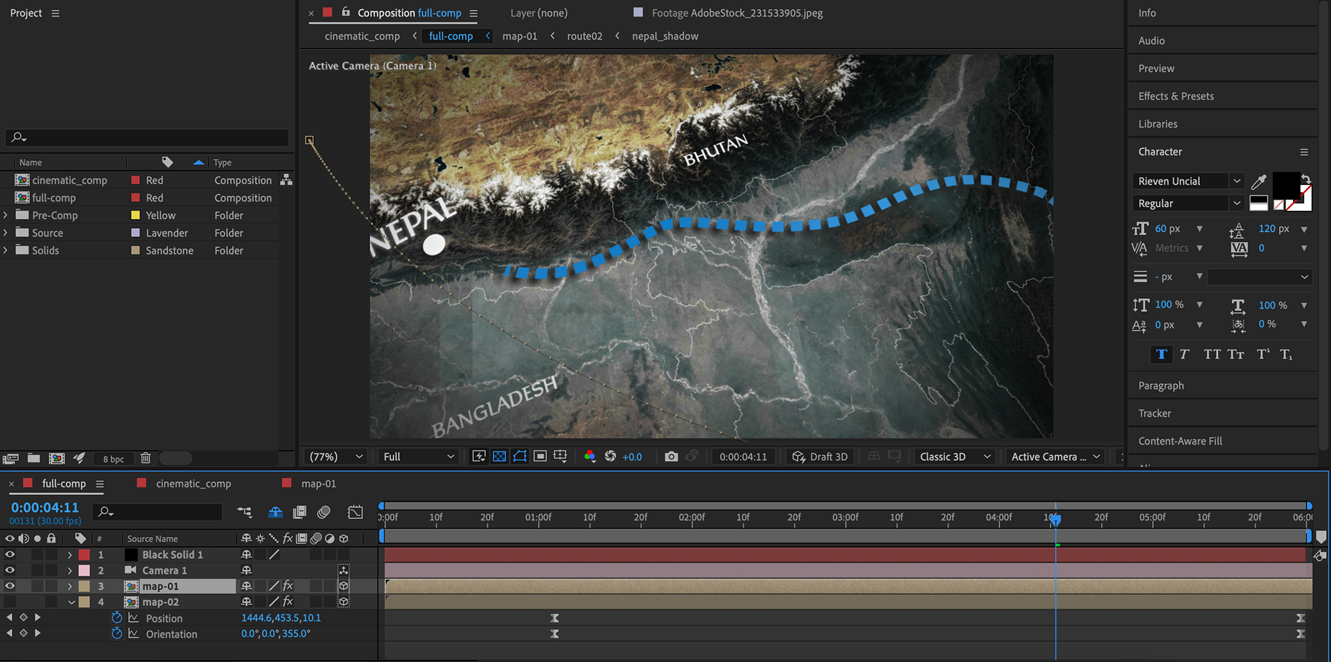
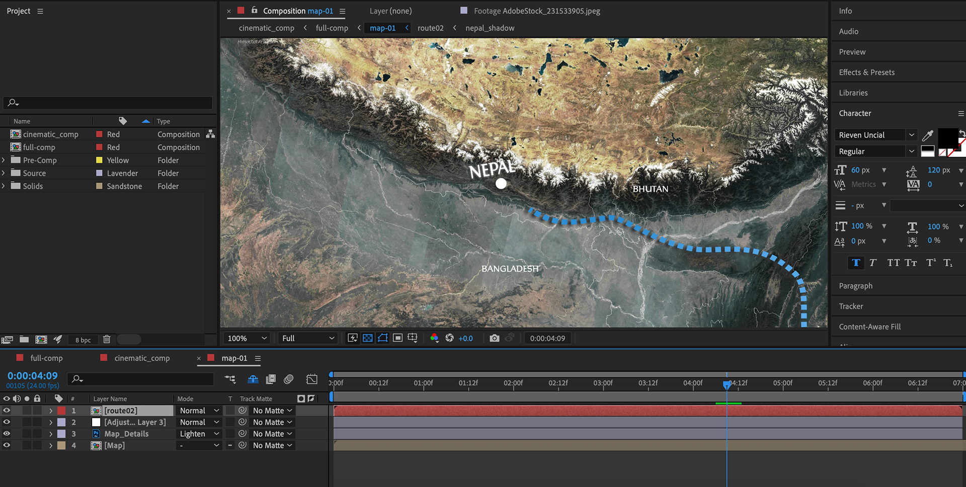
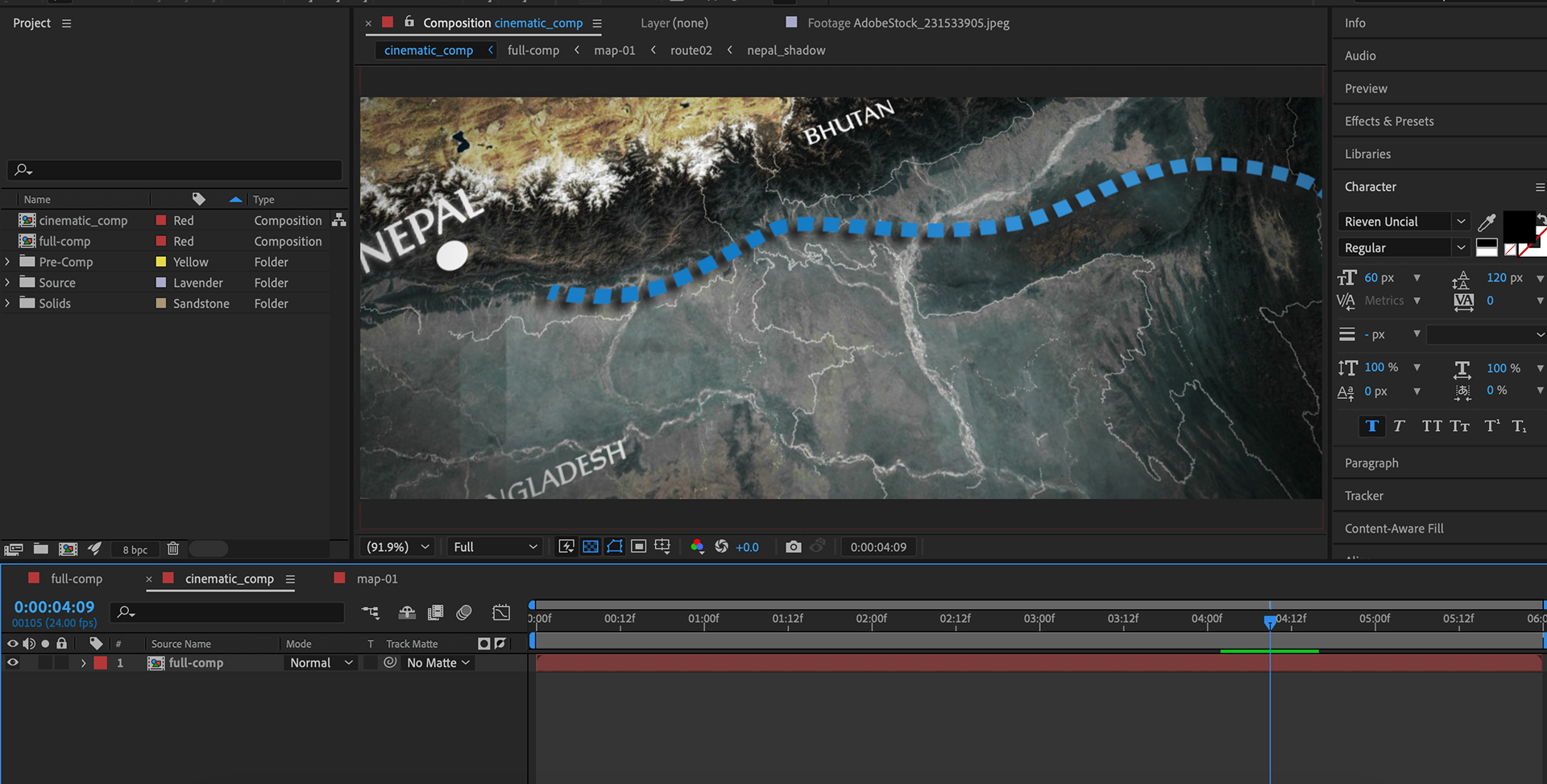
-Map: arrow is not necessary for the route.
-Tagline font needs to change.
-Shot 01 add atmospheric details.
-Shot 06 matte painting looks a little flat.
-Map: arrow is not necessary for the route.
-Tagline font needs to change.
Tasks/ Goals
My main objective for this week is to refine Shot 04 (map) and finish the look development of Shot 03. This will allow me to hand over everything to Mateo for compositing. I aim to render Shot 03 and pass it to Mateo by Saturday.
Aspect Ratio
During our team meeting, Mateo suggested changing the aspect ratio to give the project a more cinematic look. We experimented with reframing the shots and made the necessary adjustments to see if this was feasible in the time we have left. As a team, we have come to an agreement to go ahead with this decision. Additionally, we also plan to have another version where the aspect ratio will remain the same as it is now.
Shot 03A
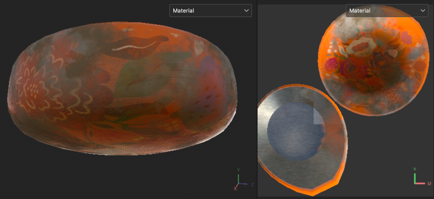
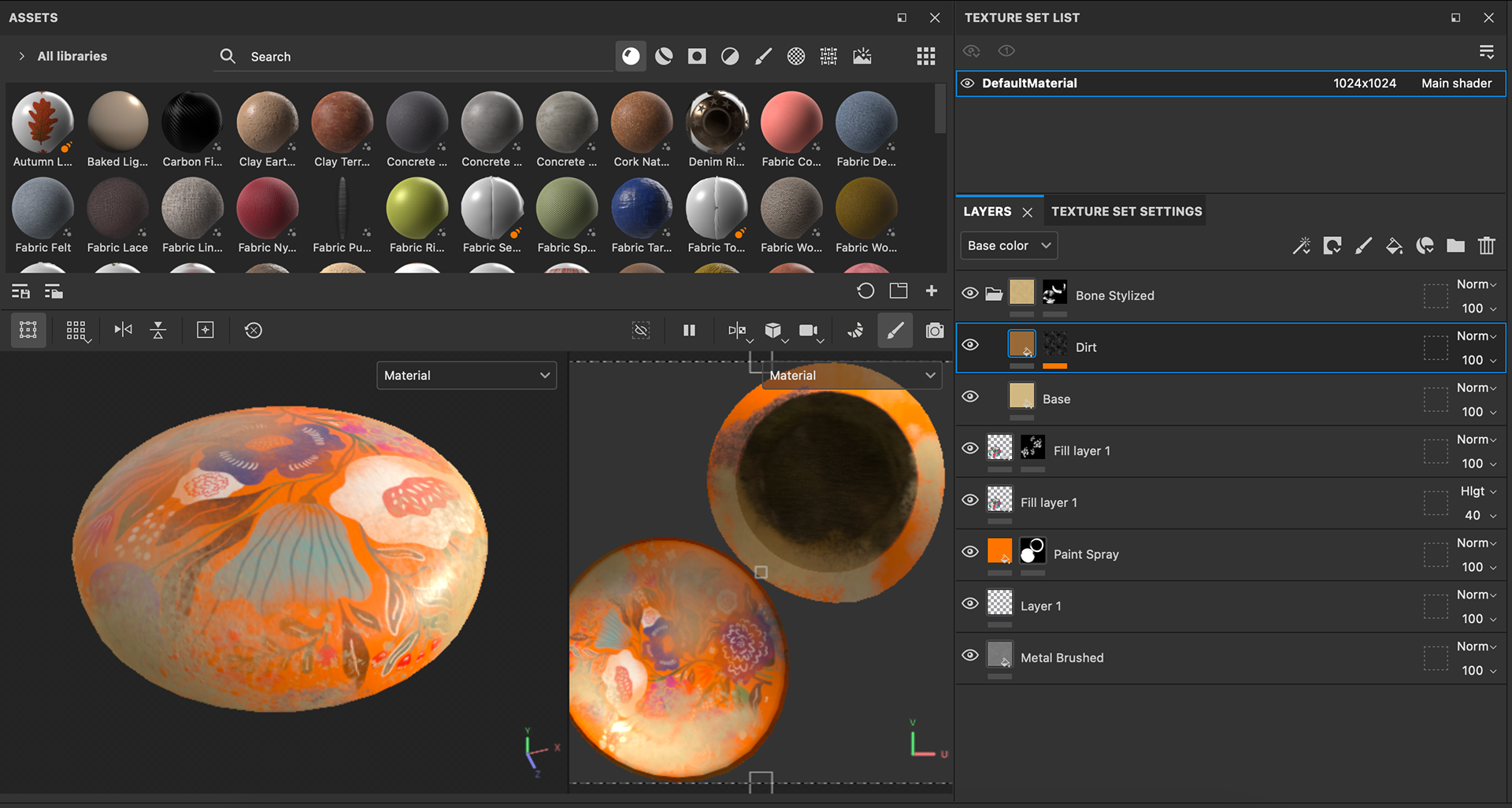
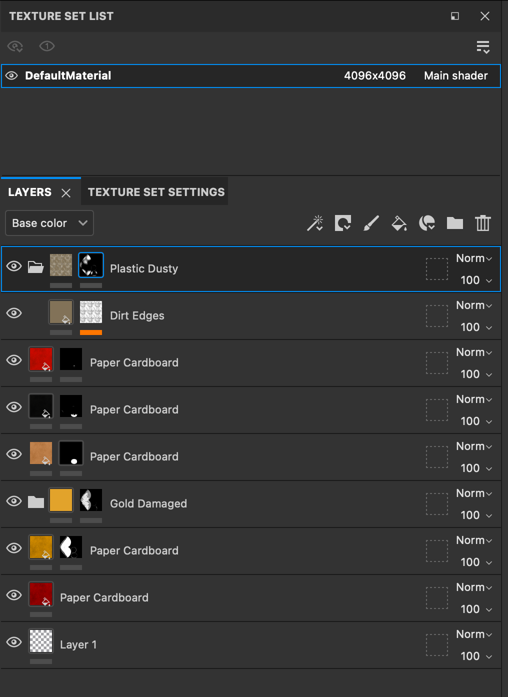
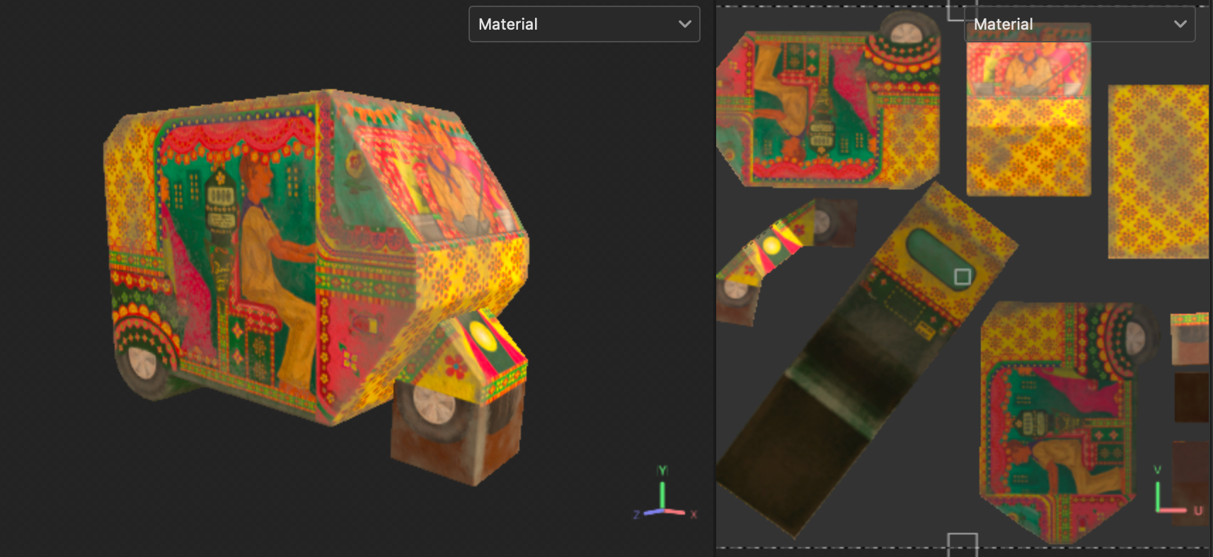
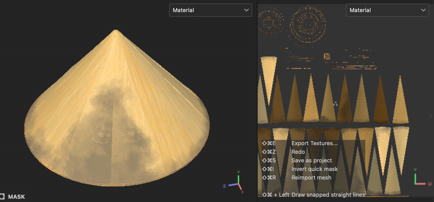
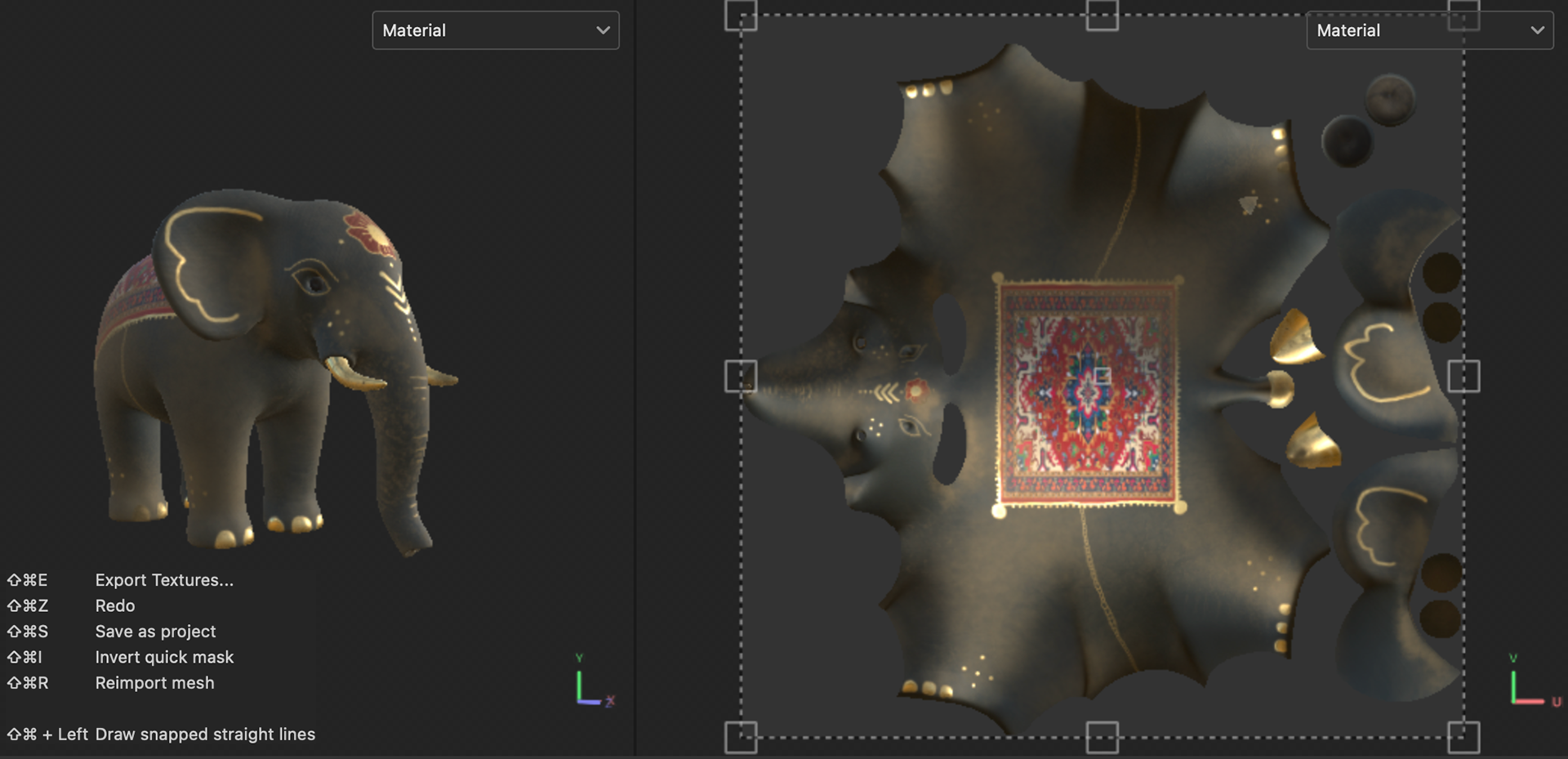
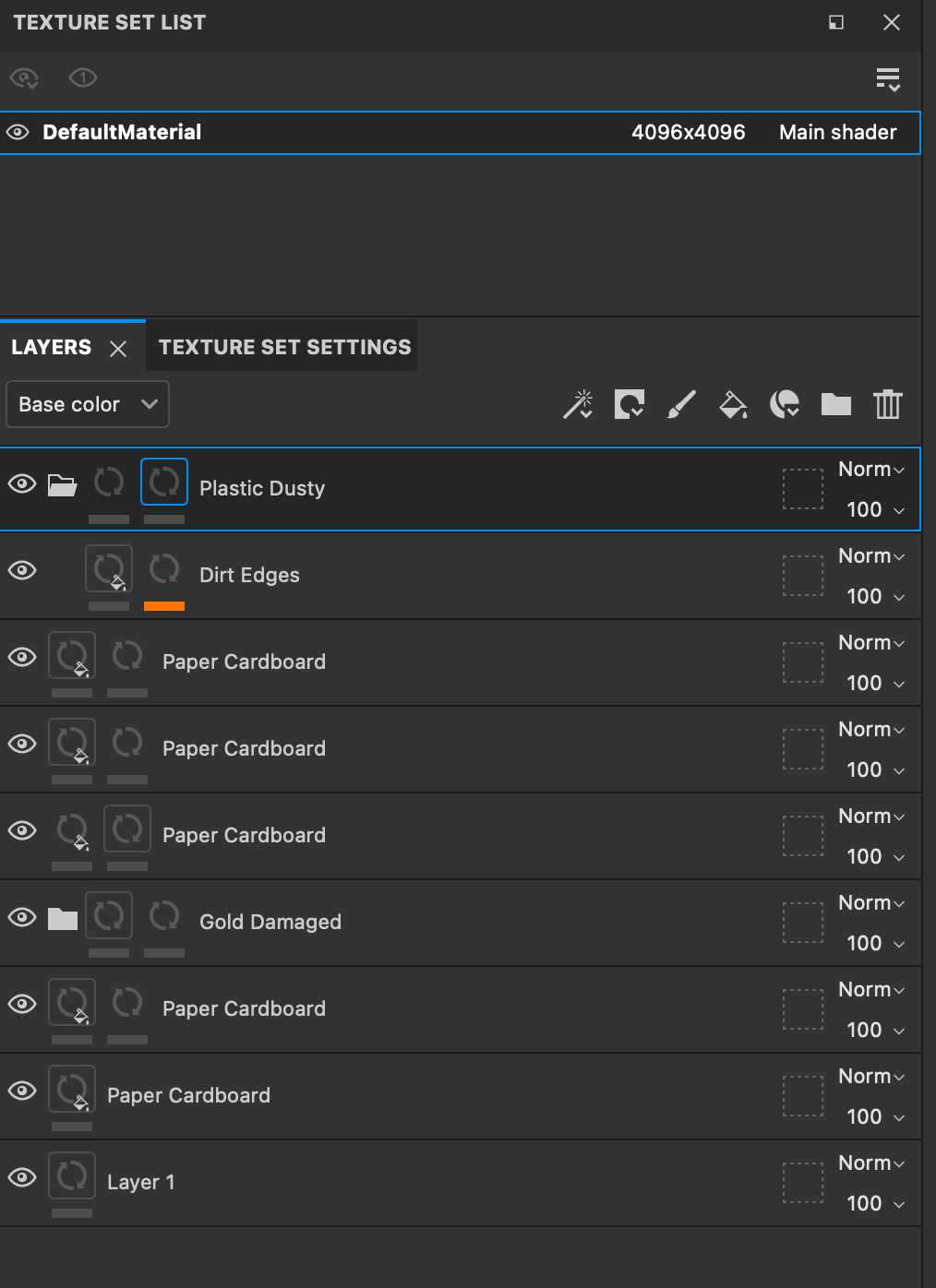
I focused on completing the look development of the souvenirs. I refined the hand-painted details and worked in a time-efficient manner by making use of resources like Adobe Stock to bring in additional graphics instead of designing and painting them. I also layered details to emphasize the wear and tear of the objects over time, like chipping of paint, scratches, dust, dirt and damage. The main focus of this shot is the elephant souvenir and I spent more time on its design and details.


Map Graphics
Worked on refining the route, added a location indicator and turned the route line to animated dashed line. I also changed the font, refined the timing factoring in time for a fade in to the shot at the beginning and eased the motion of the camera. I also adjusted the framing based on the new aspect ratio. Here is the refined map graphics and some process documentation:
Worked on refining the route, added a location indicator and turned the route line to animated dashed line. I also changed the font, refined the timing factoring in time for a fade in to the shot at the beginning and eased the motion of the camera. I also adjusted the framing based on the new aspect ratio. Here is the refined map graphics and some process documentation:


Concept, Tagline and Logo
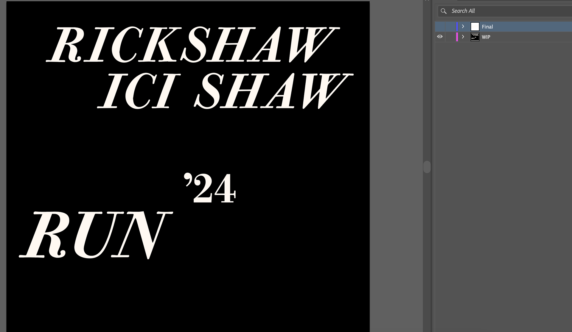
As I was editing and timing the tagline animation, I noticed that the original concept or the message behind the video seemed to be missing. So, I decided to go back and review our initial inspiration and remembered that while researching about the event "Rickshaw Run", I came across a trailer for the 2020 event. This concept of an event trailer made sense with our current cinematic aspect ratio, and we decided to finalize it as a trailer for the 2024 event.
Reference trailer video for Rickshaw Run: https://www.youtube.com/watch?v=N4ILXeZJYbw
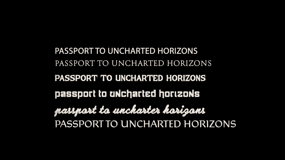
After exploring different font options for the tagline, I settled on Rieven Uncial. It combines calligraphic details with a structural look and seemed like the right fit for our trailer.
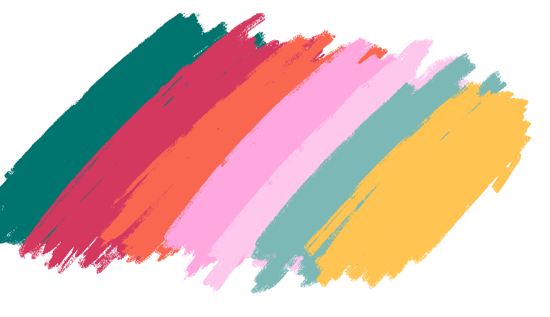
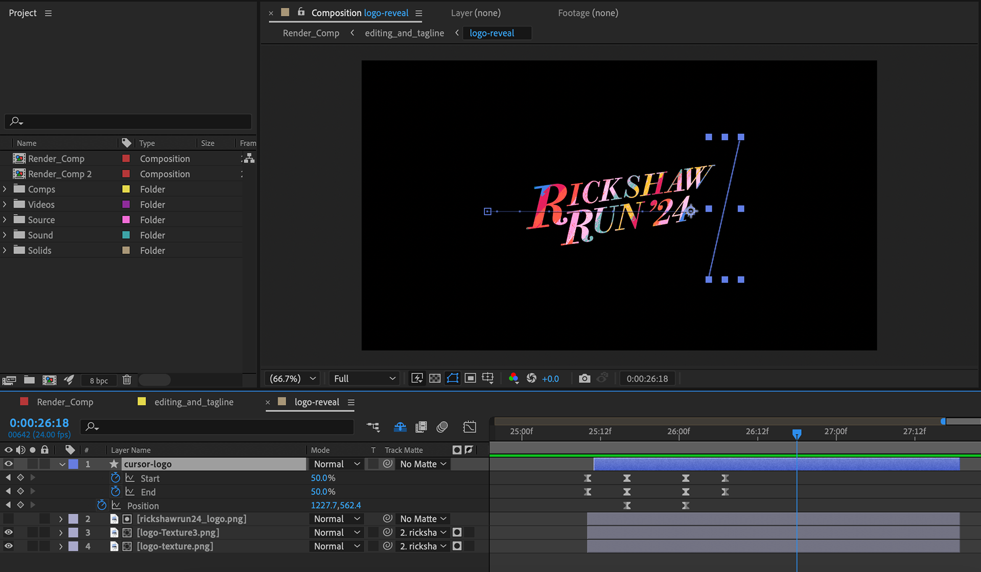
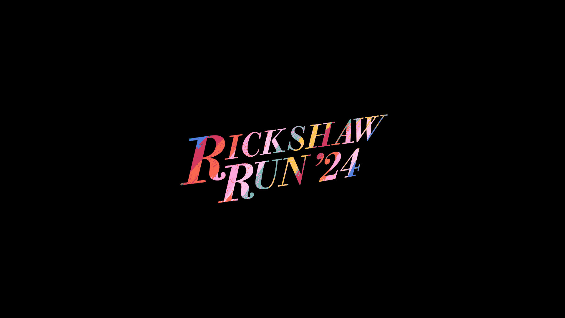
As I couldn't find a vector version of the existing logo, I recreated it as closely as possible and then added some logo treatment to brand the event for the year 2024. I used colorful texture maps that I painted in Procreate and layered them in After Effects, using the track matte feature to create a vibrant and engaging logo. For the logo's colors, I sampled and modified the tuk tuk's body color and 2D decals/ graphics. After the treatment, I animated the logo in order to enhance its visual appeal and give it a more refined and professional look.

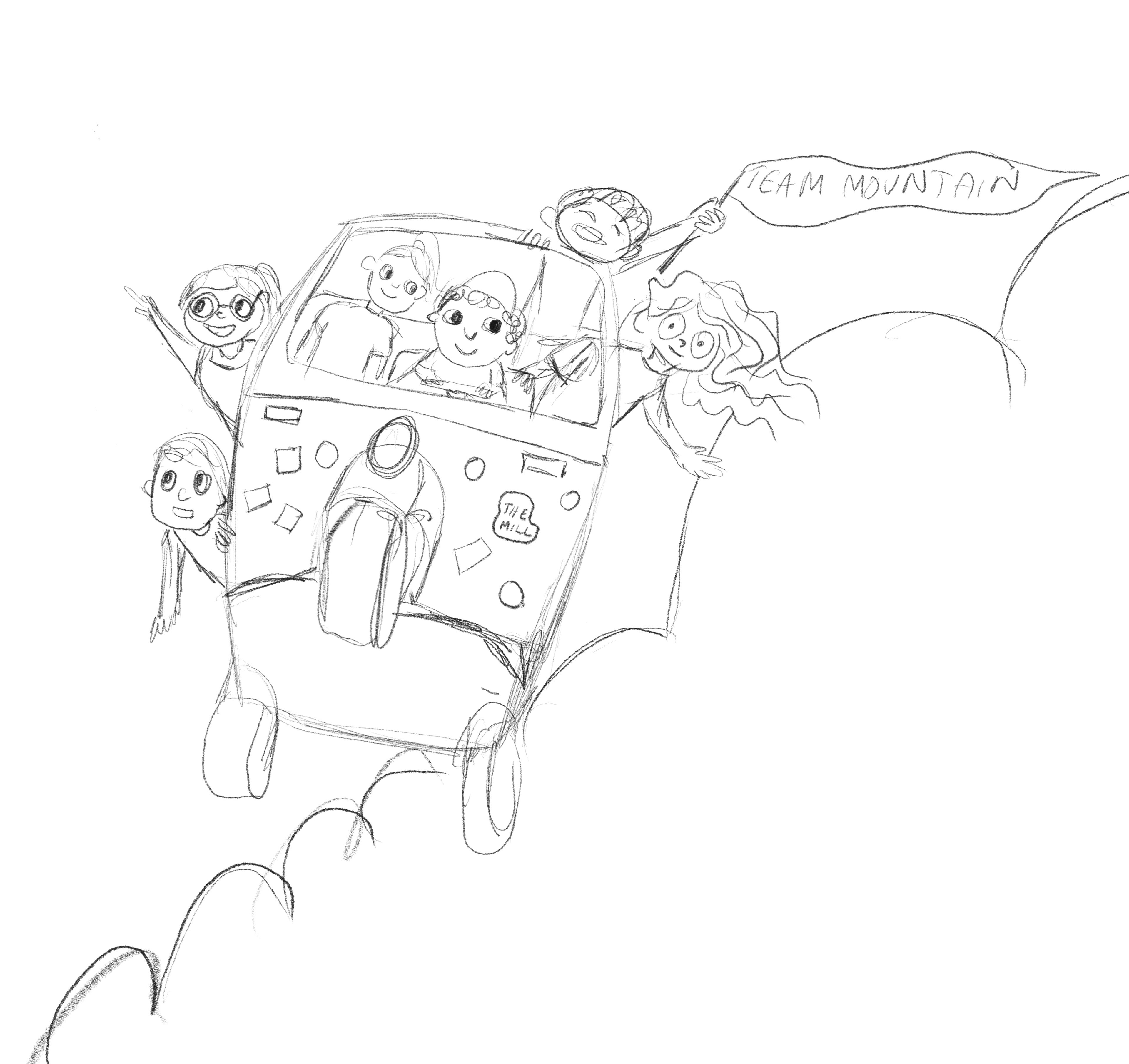
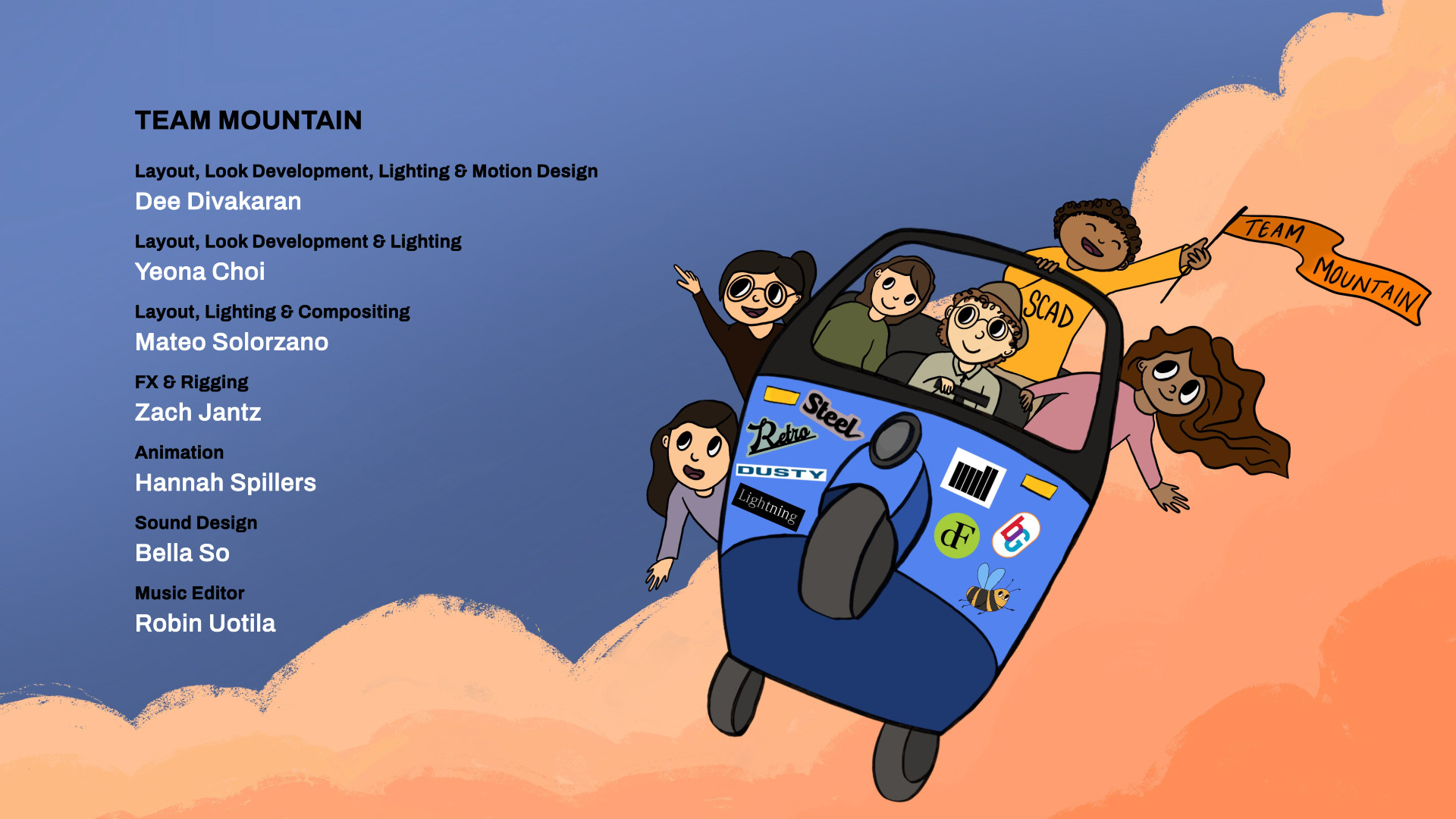
Credits Design
As part of our final presentation, we are required to include a credits section at the end of the video. I designed the credits and created an illustration to accompany them. Here is my process: