Week 05 Progress: Composition, Look Development and Compositing Workflow
Mentors Feedback Summary
- There is still a disconnect between the shots. They look like two different worlds.
- Use lighting to connect the shots.
- Smooth out the camera movement and adjust the speed.
- Slow down when the trail comes up over the mountain and speed up in areas where there aren't a lot of details.
- Camera moves at the end of shot 02 could be similar to shot 03 to connect them better.
- Connect the shots using elements like lighting, color, details, or even similar camera movements.
- The environment layout needs to be polished.
- Motion blur is still unclear or is too subtle, especially with the gold leaves.
- The product packaging at the end needs to be worked on so it doesn't feel so bare at the end. But it should be fine if there's a logo or design on the packaging.
- The two black spaces in live-action feel like they need some details.
- Adjust the live-action plate so there are some details of the purple fabric and folds visible, and it's not so dark on the sides.
- Lighting on the product in Shot 03 needs to improve. Right now, it's too even, and the highlights are hot.
- Augment the lighting a little in the live-action plate to match or connect it with the other shots. Right now, it's a little darker and moody. Maybe this could be the direction of lighting in the other shots as well.
- Once the other shots are worked on, what needs to be done to shot 03 will also become clear.
- The overall shape of the gold cloth is good. The right edge might be a bit too straight.
- Clean up the dark loop in the front (live-action plate). Extend the fabric to get rid of it.
- Framing shot 03 better.
- Differentiate between the thicker FX trail and the secondary thinner trails. Hero the thicker FX trail.
Week 06 Milestone
- Connecting the shots by adding details (camera movement, lights, colors, assets).
- The layout & lighting of the CG environment need to improve as this dictates the changes that need to be made to shot 03.
- Smooth out camera movement for shots 01 & 02.
- Work on product package design for shot 03.
- The layout & lighting of the CG environment need to improve as this dictates the changes that need to be made to shot 03.
- Smooth out camera movement for shots 01 & 02.
- Work on product package design for shot 03.
My Task Breakdown:
- Main goal: Block out everything as fast as possible.
- Smooth out camera motion and speed ramp issues.
- Product package design.
- Work on refining asset models, look development & lighting for environment layout.
- Main goal: Block out everything as fast as possible.
- Smooth out camera motion and speed ramp issues.
- Product package design.
- Work on refining asset models, look development & lighting for environment layout.
Shot 02 Comparison
I created a video comparing the footage of the last two weeks to analyze the camera movement. By doing this, I was able to determine how to make it smoother and fix the current issues. I find it beneficial to study the changes I made in the past to gain a better understanding of my approach and improve my skills going forward.
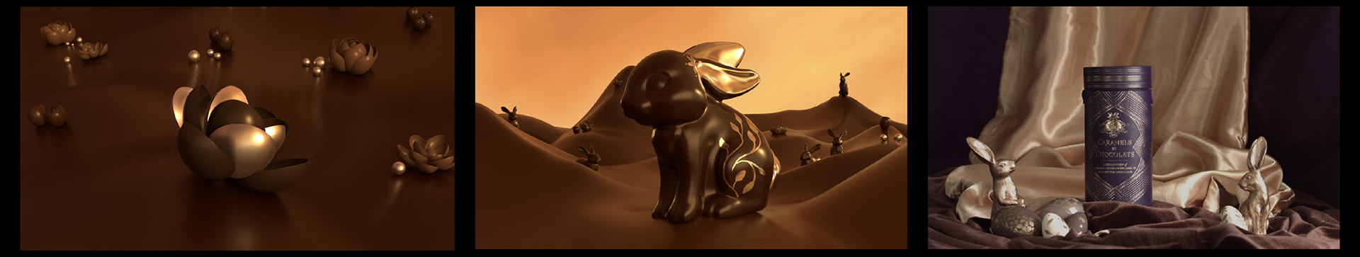
Layout Assets References
I referred back to my reference library to start developing the details in the environment for shots 01 & 02 this week.

Sound
I adjusted the previs edit to include more animation time for the blooming flower, allowing Sawyer to work on and adjust the sound.
Lighting & Layout
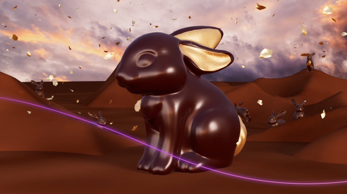
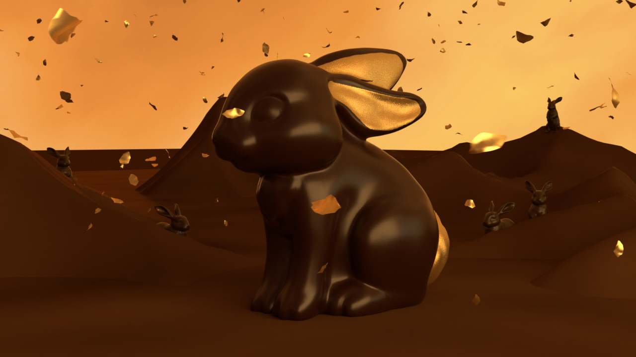
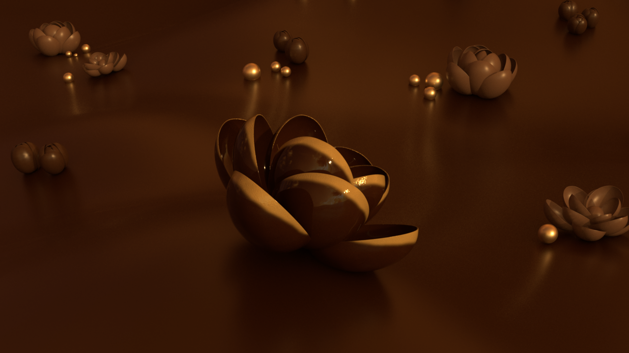
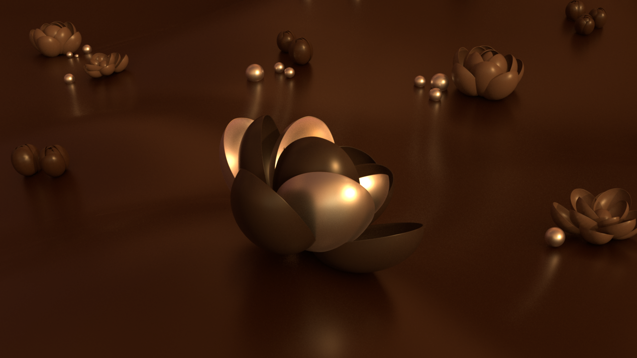
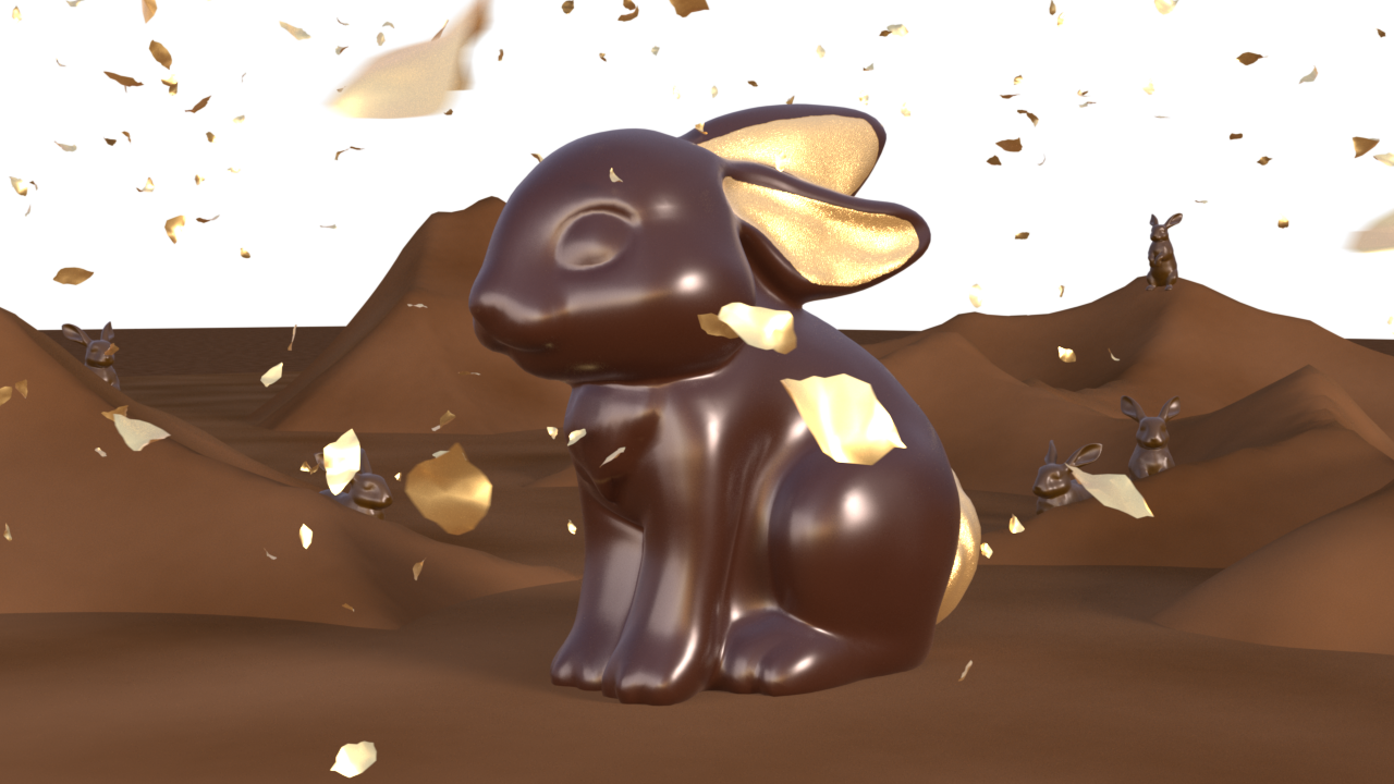
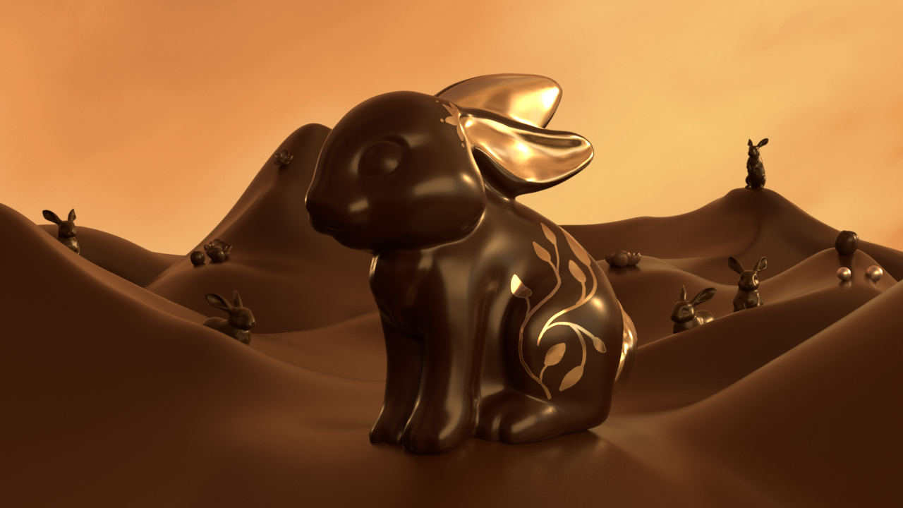
I decided to focus on improving the lighting first this week, as it was the last thing I had updated in the past few weeks. During our mentors feedback session, Molly suggested that lighting is one element that could be used to connect our shots better. I studied the overall lighting and colors in our live-action plate and made some changes to match it. For instance, I changed the sky to a more golden hue to match the backdrop in our live-action plate. I also adjusted the light to come from the bottom right side.
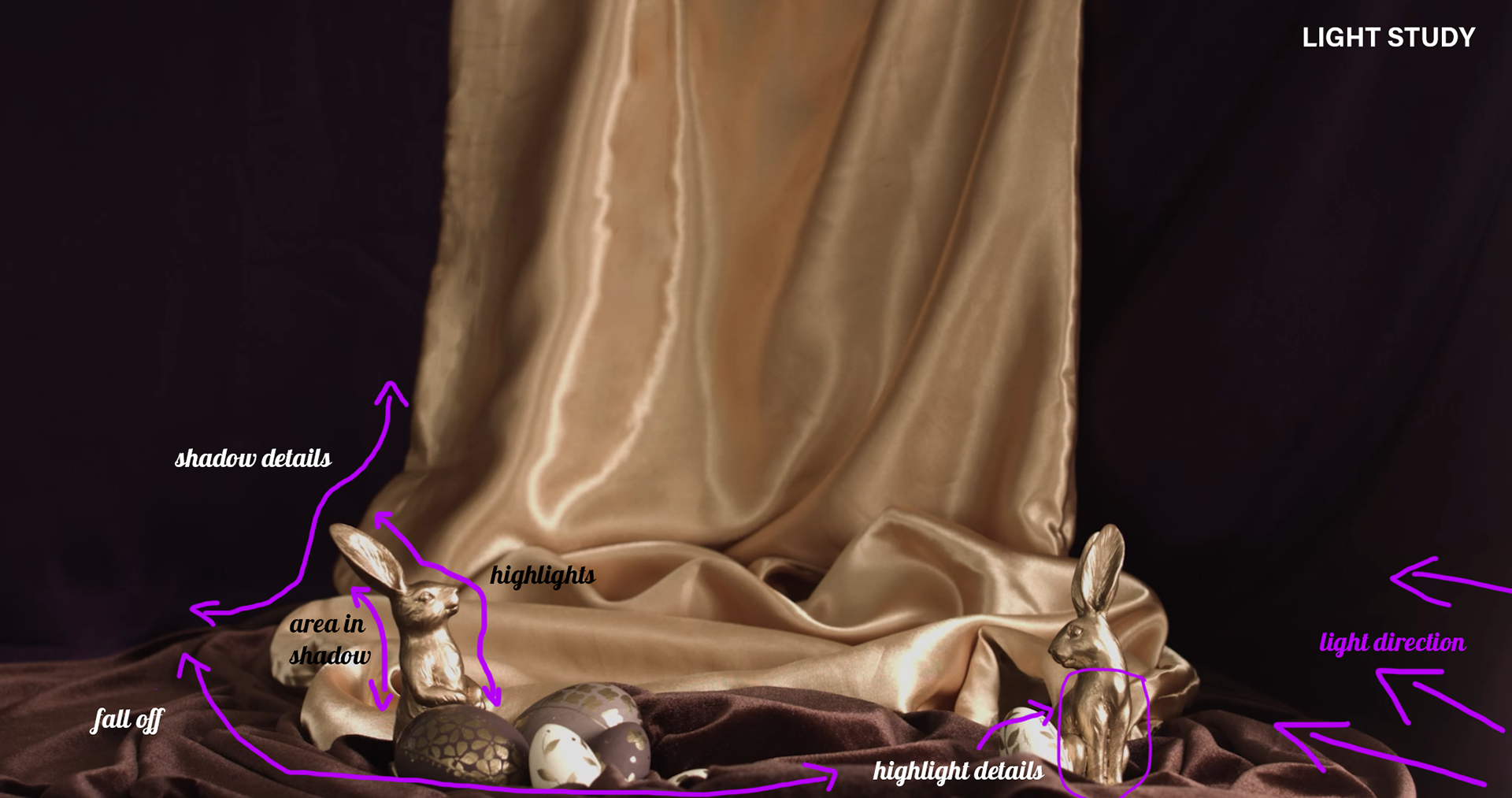
Here is a comparison between the lighting from last week (left) and the adjustments from this week (right).

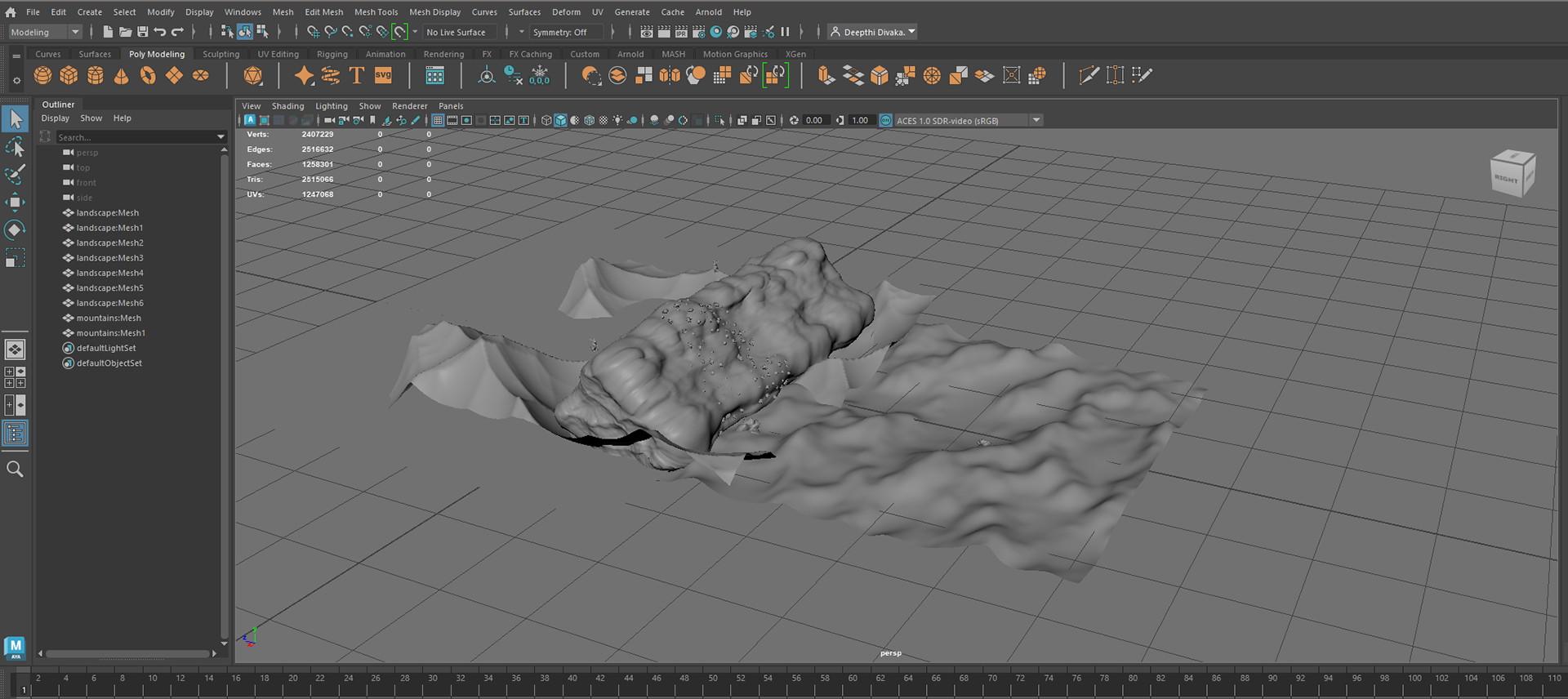
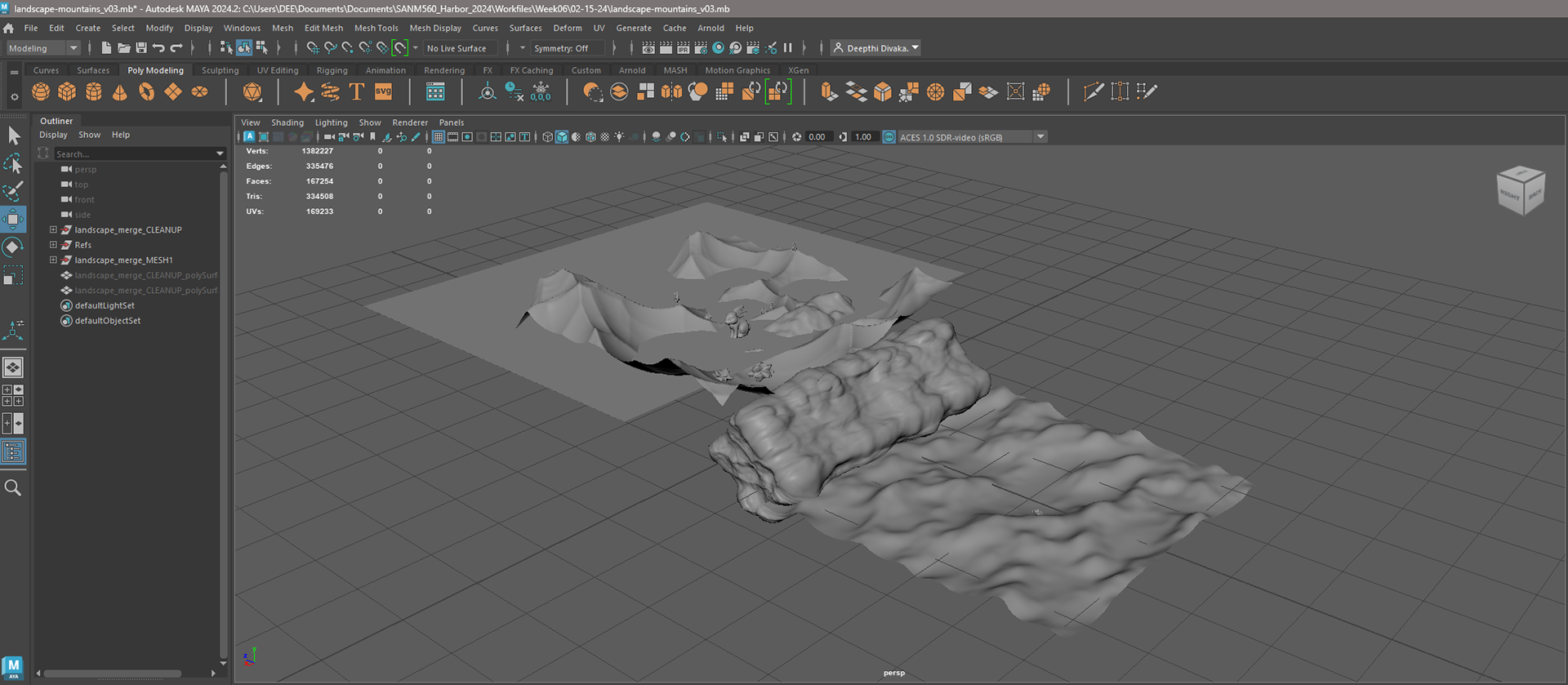
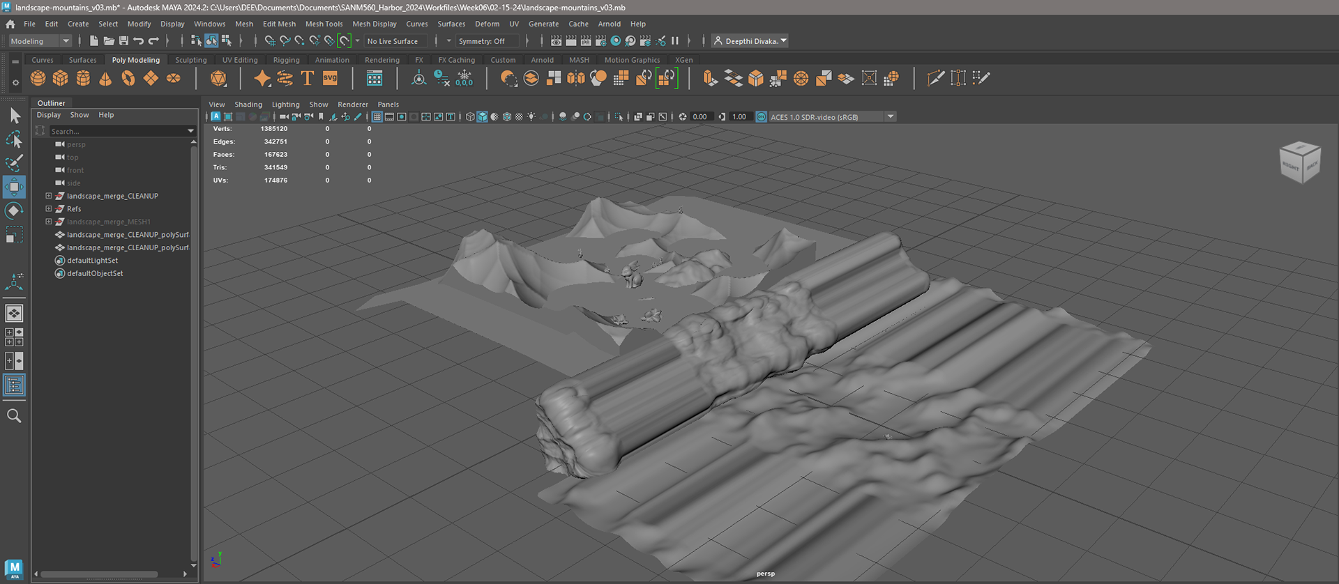
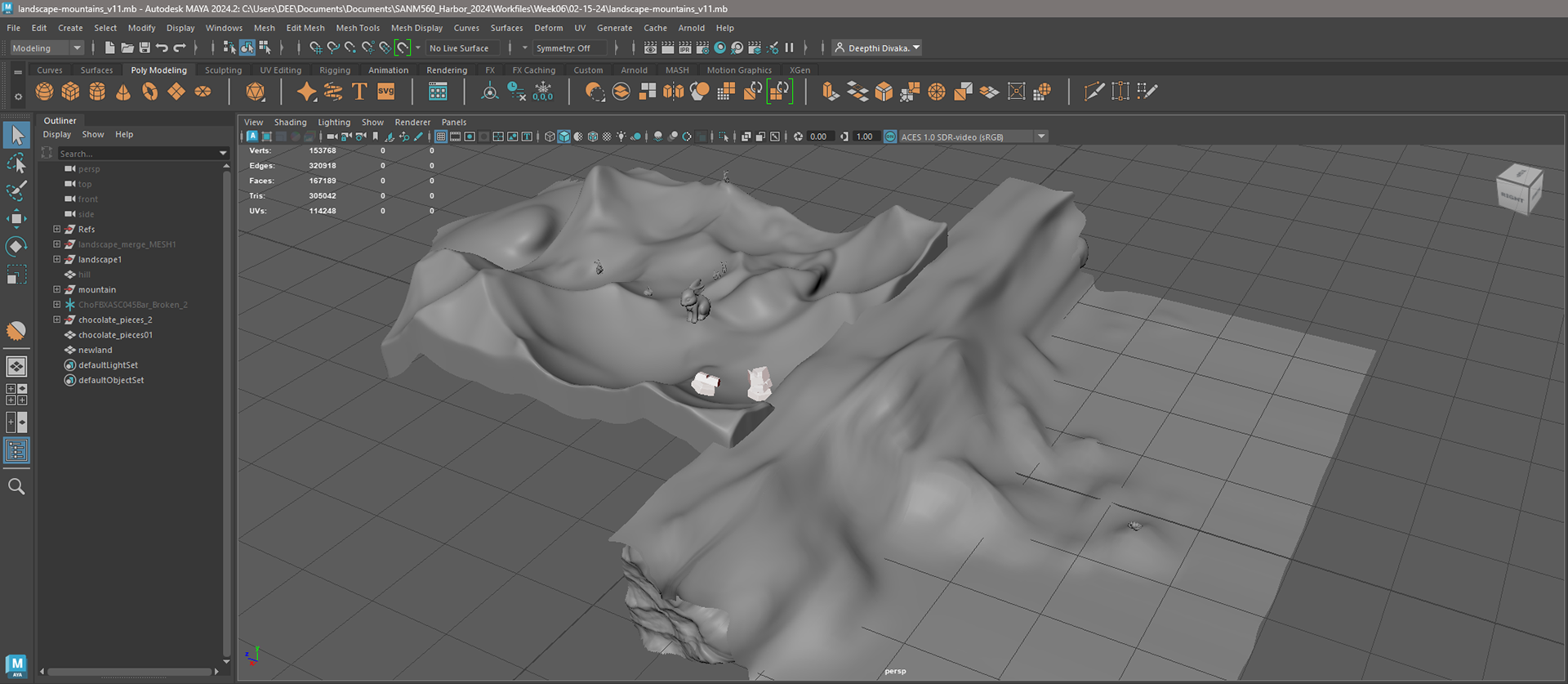
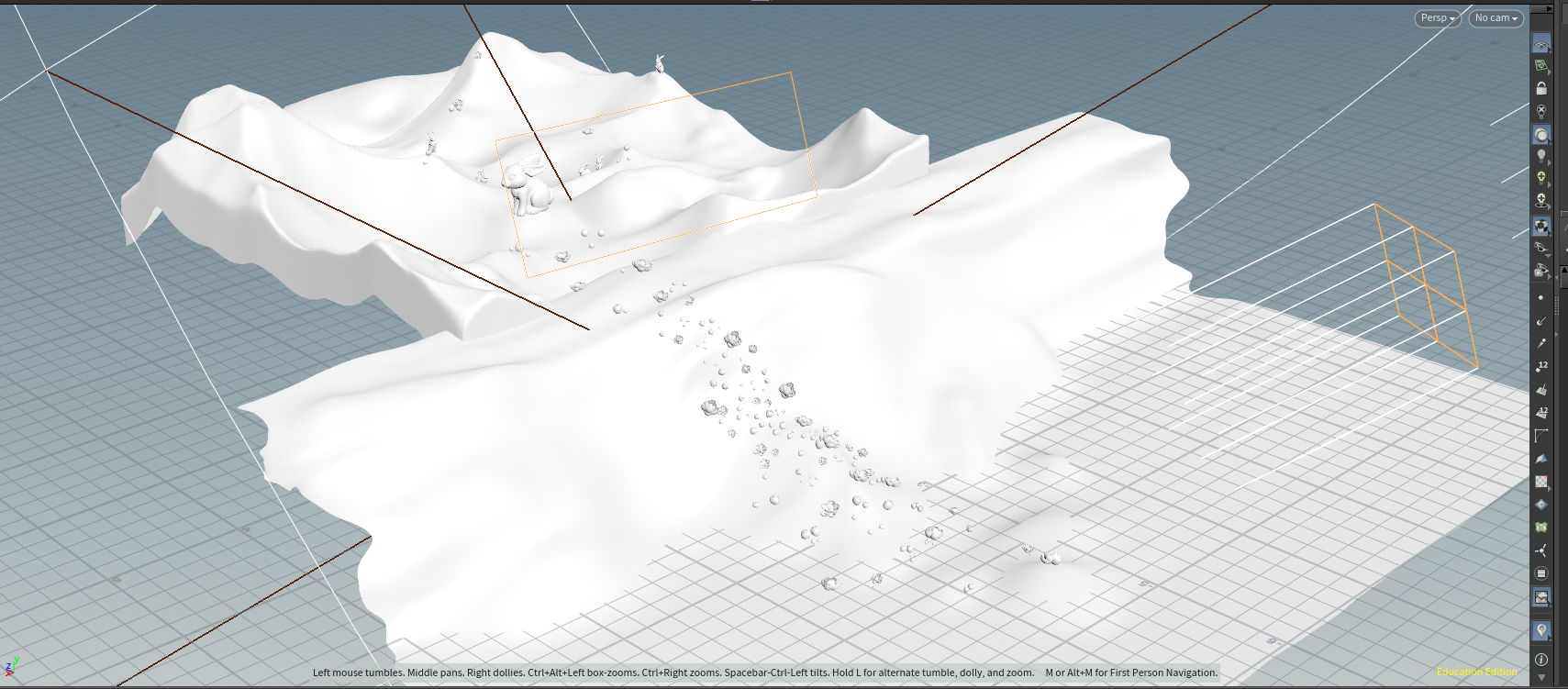
Once the key light and colors were set, I switched over to the layout to improve its shape and framing. I imported the landscape sections into Maya, cleaned up the geometries, and started combining and sculpting the shapes to start defining the space we are in. I used functions such as cleanup, reduce, and retopologize to prepare the model for sculpting. Then, I smoothed it out to ensure enough segments were present for proper deformation and to aid in the sculpting process.
One of the professors' feedback was to break up the straight horizontal line at the back. And the layout of the area where the flower is located is unclear. I sculpted more shapes to break up the straight line and soften the overall structure to resemble folds on the ground plane in shot 03. I aimed to incorporate key aesthetic characteristics from shot 03 into shots 01 and 02 in order to unify the look and feel of the world.
Camera
I adjusted the camera, but it felt like I ended up creating more issues. I believe the problem is that I have been looking at the camera for too long and lost track of how to fix the problem. So I reached out to Yanni for help. She kindly agreed to help me address the issues and suggested a different approach to the camera movement. Below is a side-by-side comparison of the video footage from last week and the changes I attempted to implement. Additionally, I have included a comparison of the footage from my camera to the changes that Yanni made.
Lighting & Layout Progress (Bunny & Flower)
I further refined the lighting and created a process video to track my progress this week. I managed to establish the main details for the bunny and flower, but I aim to refine this further next week. My focus for next week will be improving the overall lighting and finding ways to unify the lighting in all the shots.
Sequence Render Test
I performed a render test and detected some artifacts that I plan to address once I have the whole environment layout setup.

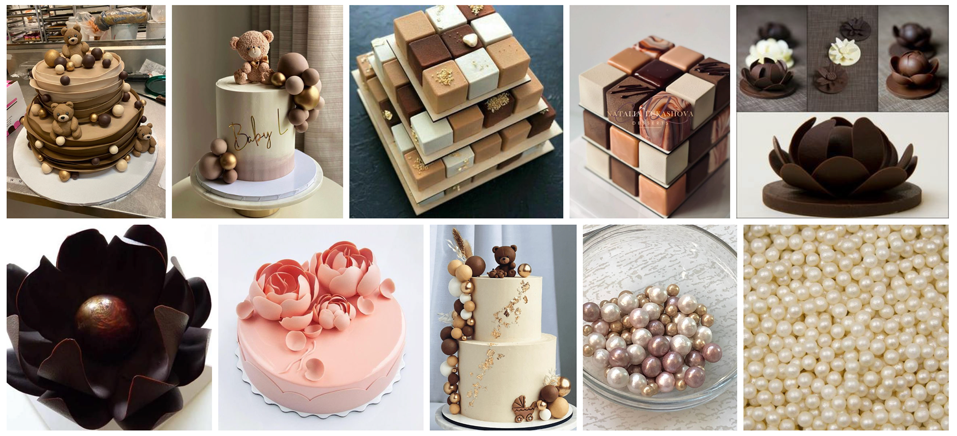
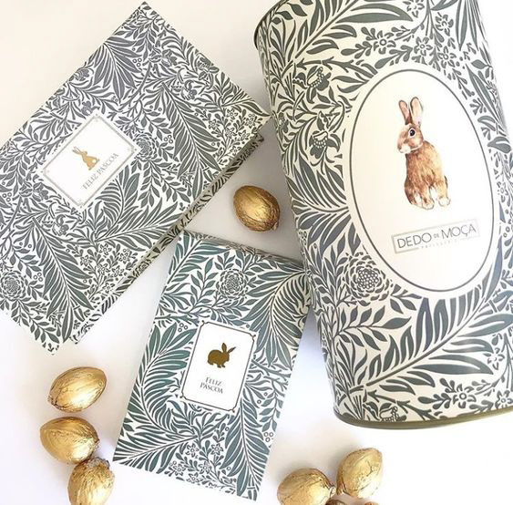
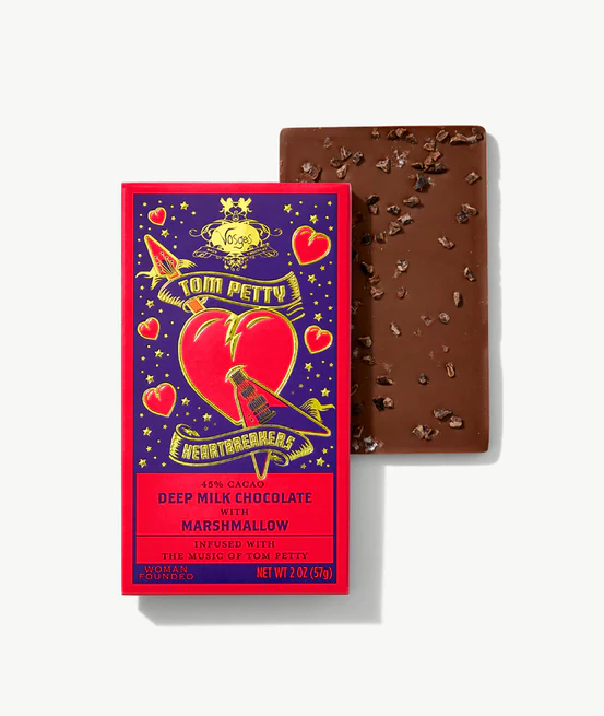
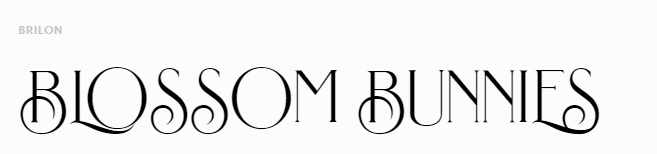
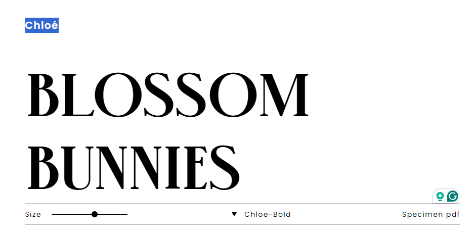
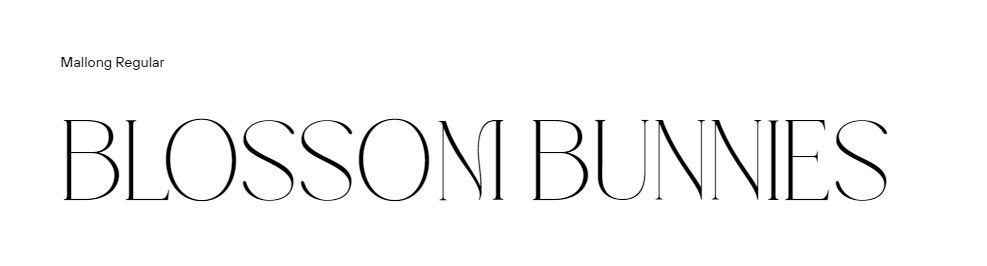
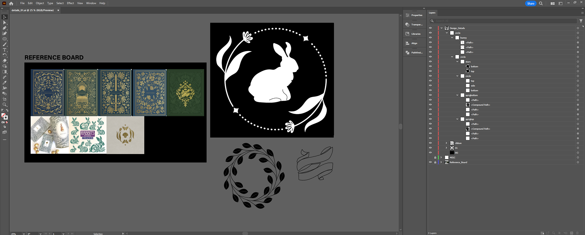
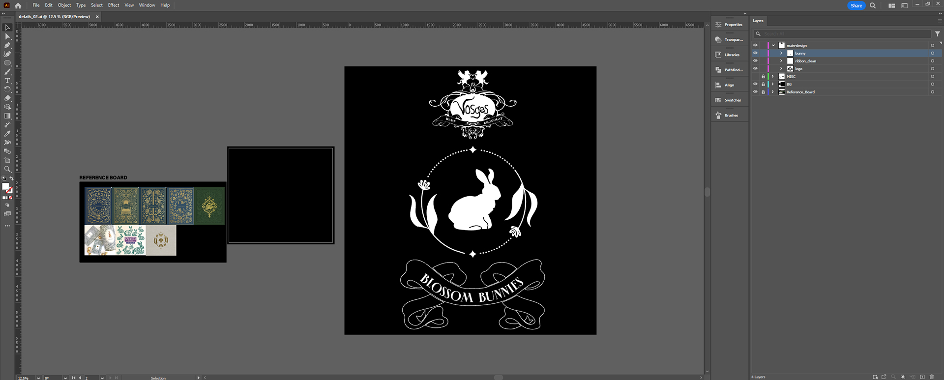
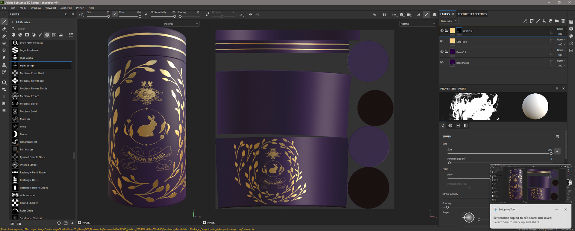
Package Design References
These are the references I used to design the packaging, and below that is my font exploration. I opted for a serif font that resembles the ones used by Vosges on their packaging. I experimented with more intricate and detailed versions but ultimately decided to go with the Chloe font as it is legible. This is crucial for our commercial, which features a shot of the product at the end. I wanted the product name to be clear, readable, and have a touch of structure and style.
For the filigree, I incorporated floral and leaf motifs to fit the Easter theme and our product name, "Blossom Bunnies."


Chocolate Box Package Design Update
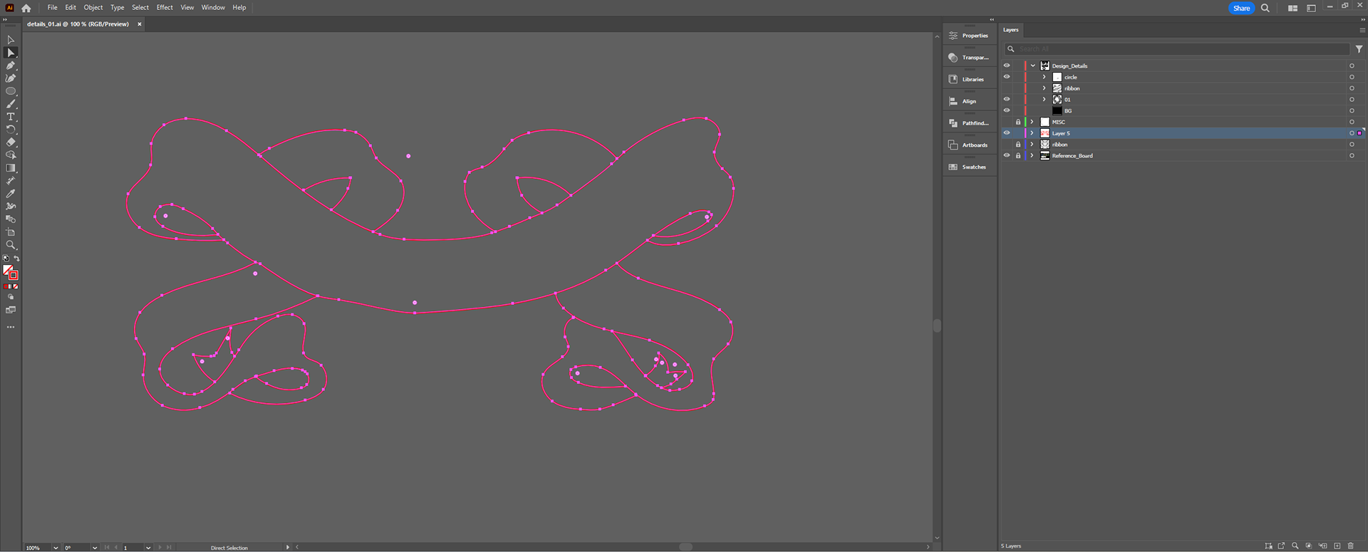
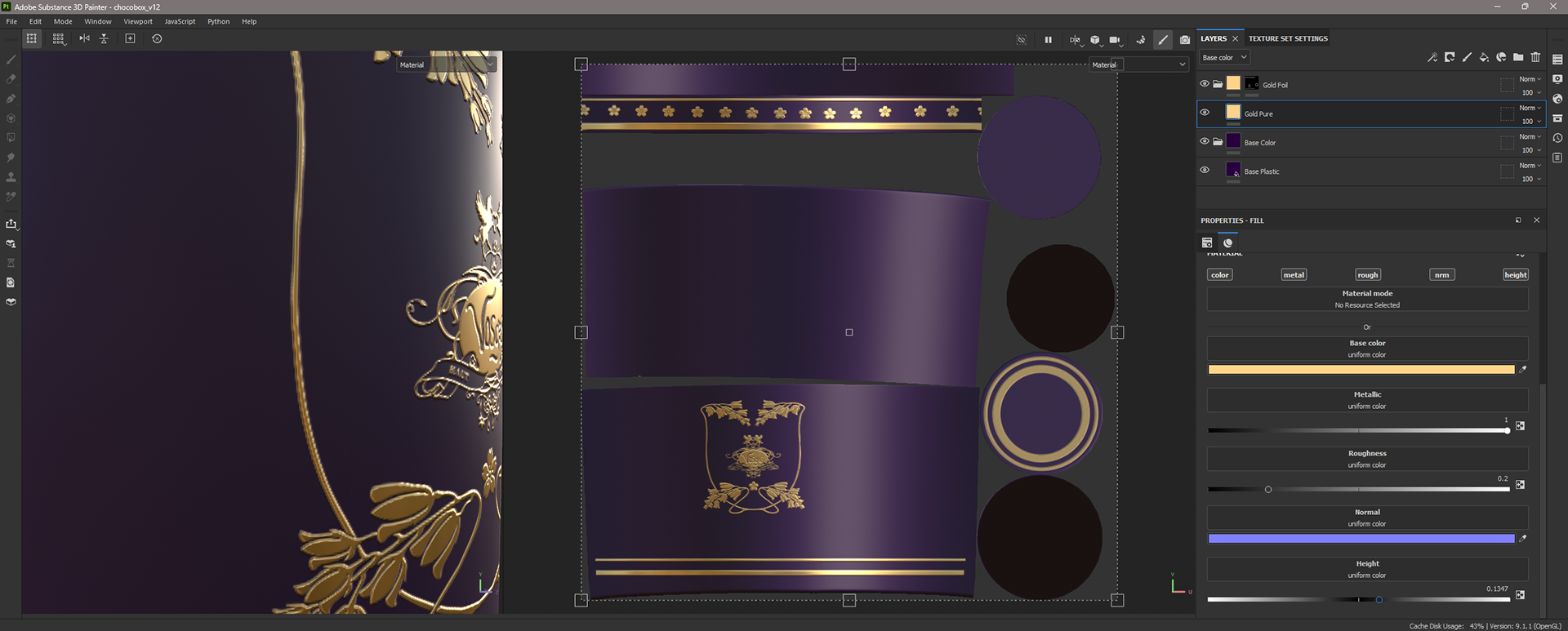
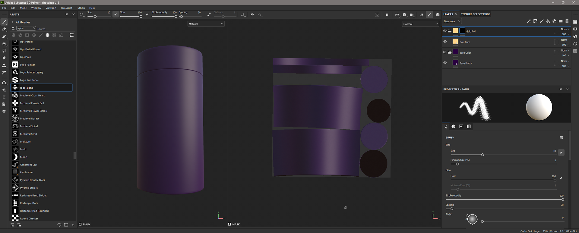
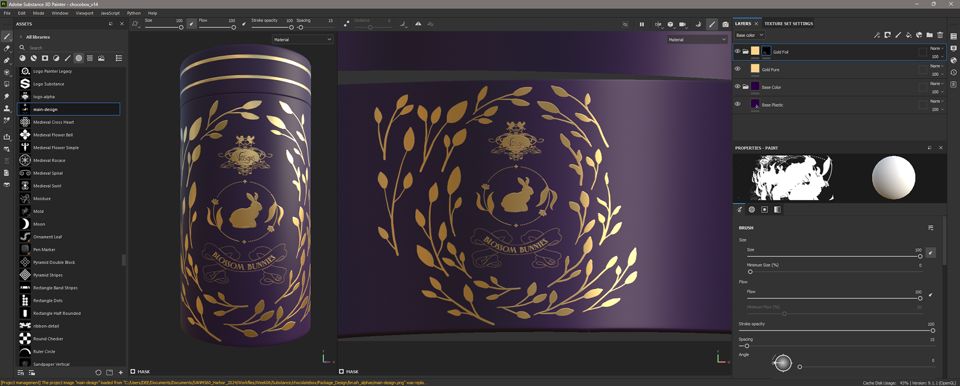
I created a reference board to help me design the package details. Then, I used the pen and brush tools in Illustrator to draw out the details and refine the shapes. After that, I made an alpha map and imported it into Substance Painter for later use. I first adjusted the bump height of the gold foil details and then erased the previous design so that I could paint the new one. I used the alpha as a brush to paint the main design in the middle and freehanded some of the branches and leaves details around it. My goal for the package design this week was to roughly block the design placements to determine what other details need to be added or taken away. I plan to refine it further next week.


CG Set Dressing
Based on the camera movement updates for shots 01 & 02, I adjusted the initial assets and blocked out their placement.
Based on the camera movement updates for shots 01 & 02, I adjusted the initial assets and blocked out their placement.


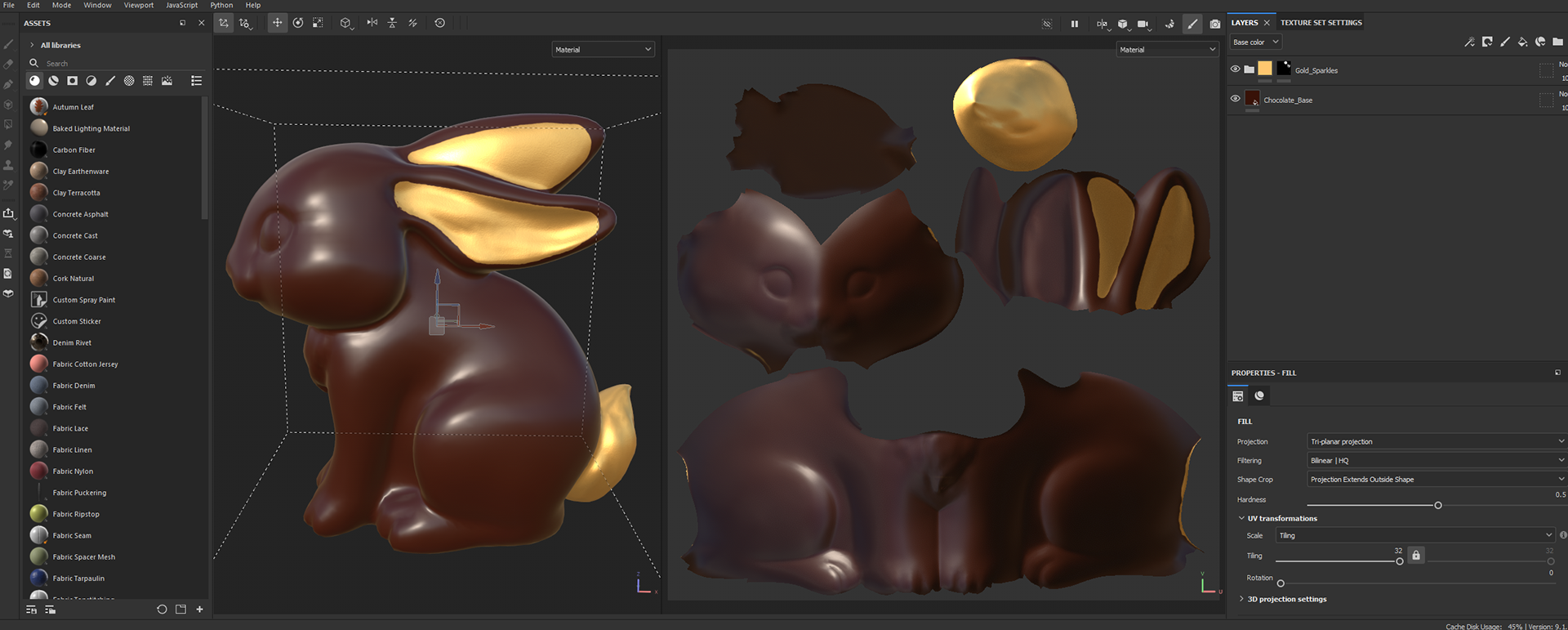
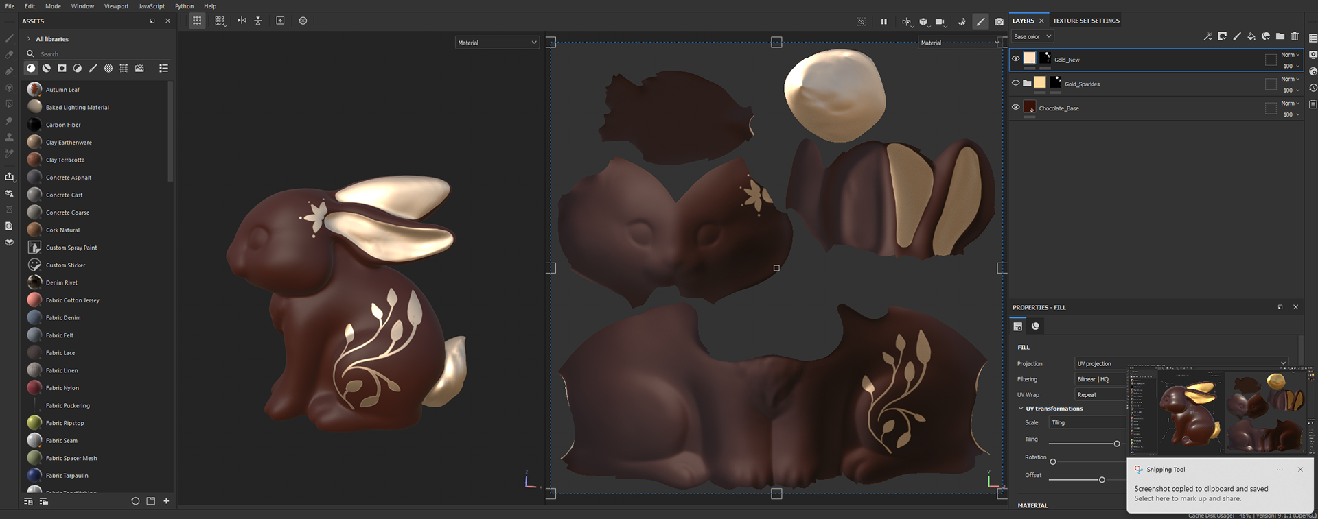
Shader Adjustments
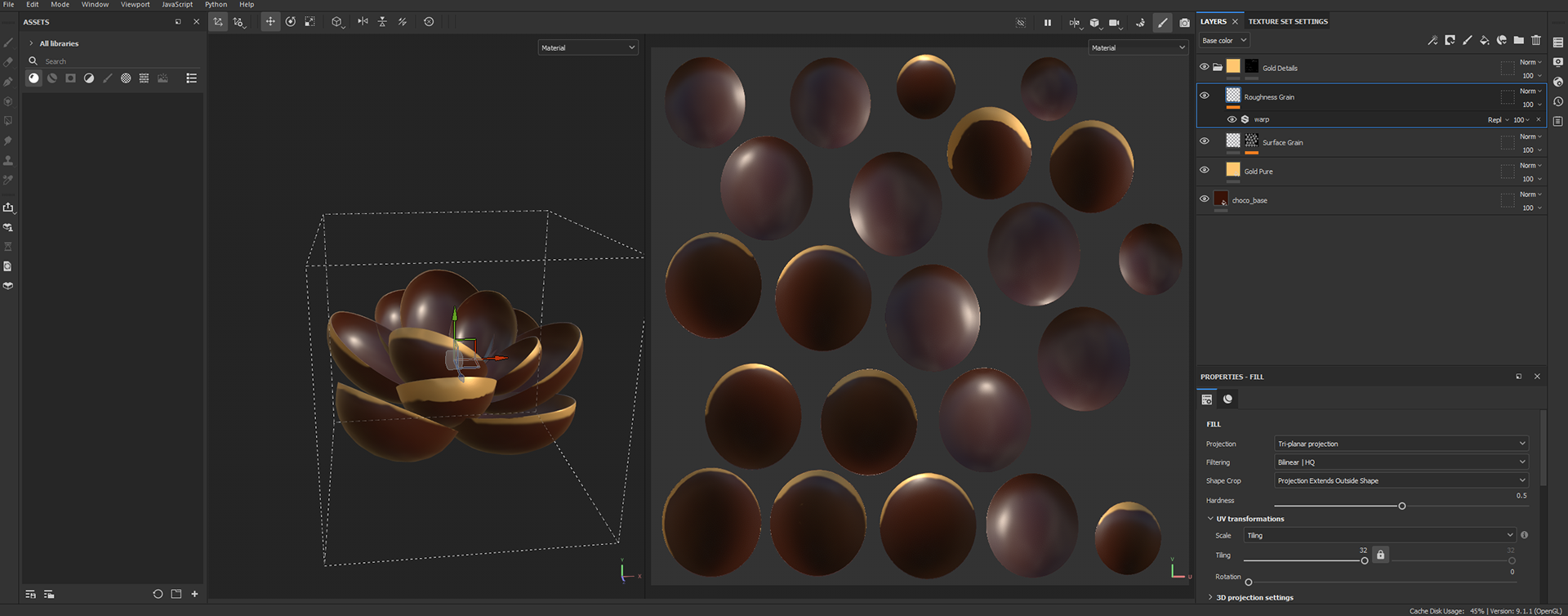
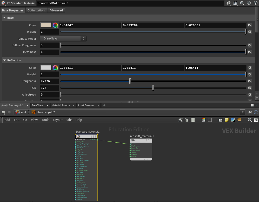
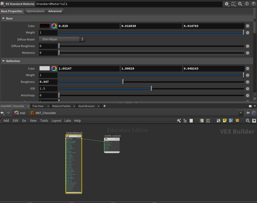
I updated the shaders for the bunny and flower to give the gold details a more metallic appearance and eliminate the flat yellow shaded look from before. I added filigree details to the bunny to match the package design and connect the shots. I used Substance Painter for the bunny and redshift materials for the flower.

Continuity Quilt
I created a continuity quilt to evaluate the shots and achieve consistency, making them look like they belong in the same world. I adjusted the lighting to eliminate artifacts and reduced the saturation of the yellow tones in the shaders and sky to match the live-action plate a little closer. I will continue working on the shaders next week.
I created a continuity quilt to evaluate the shots and achieve consistency, making them look like they belong in the same world. I adjusted the lighting to eliminate artifacts and reduced the saturation of the yellow tones in the shaders and sky to match the live-action plate a little closer. I will continue working on the shaders next week.