
After our check-in with the Harbor mentors this week, we had a team meeting to discuss our goals, based on the feedback we received. We also wanted to make sure we knew what each of us need to focus on in order to get a first composite by next week.
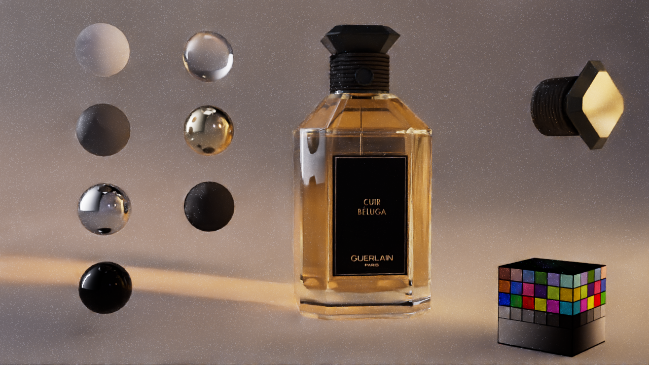
The FX artists, Thalia and Galina, would focus on pushing the spritz and pyro effects as far as possible while me and lighter and modeler Emma will focus on getting the glass shader to look as accurate as possible. We received comments on the dark refractions of the shader and were told to check where those were coming from. We were also told to art direct the whole look since that would create more interest to our compositions and show off the perfume bottle's details in the best way.
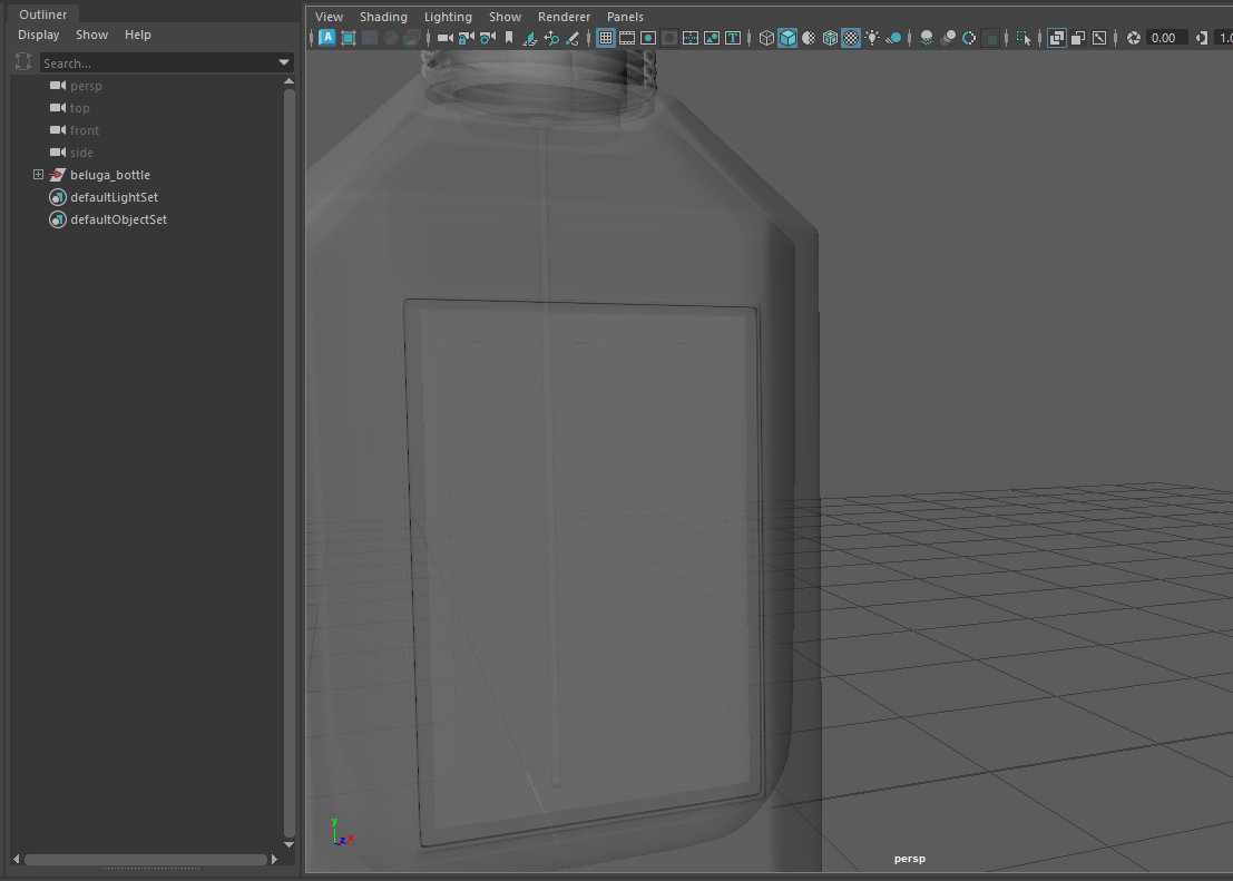
I worked with Emma to troubleshoot the refraction issue and also to work on the color of the liquid inside the bottle. We received feedback on the liquid and were told it looks more like whiskey right now. We wanted to make sure we have the right look and feel to our commercial so we wanted to make sure we pay attention to these details that could really make or break the whole feel or tone of the commercial.
I learned a lot during our troubleshooting session and learned that the RSMaterial node has different render models under BRDF: Beckmann (Cook Torrence), GGX, and Ashikhman-Shirley, and each of these could make a difference on the look of the shader. This process was helpful to understand which material nodes we should be working with to get the right look. The whole process is documented on Emma's blog in detail.
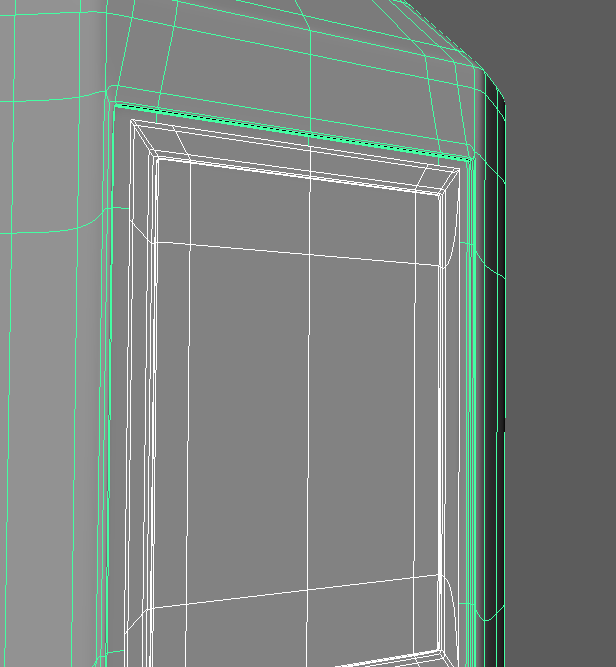
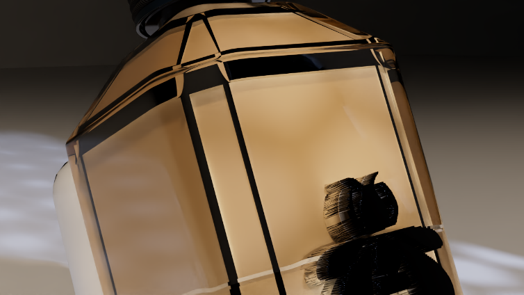
I further examined the thickness of the model to make sure the geometry of the bottle looks correct with the shaders and lighting. I made changes to the model and passed it off to Emma so she can continue working on the look development with the shaders and lighting.
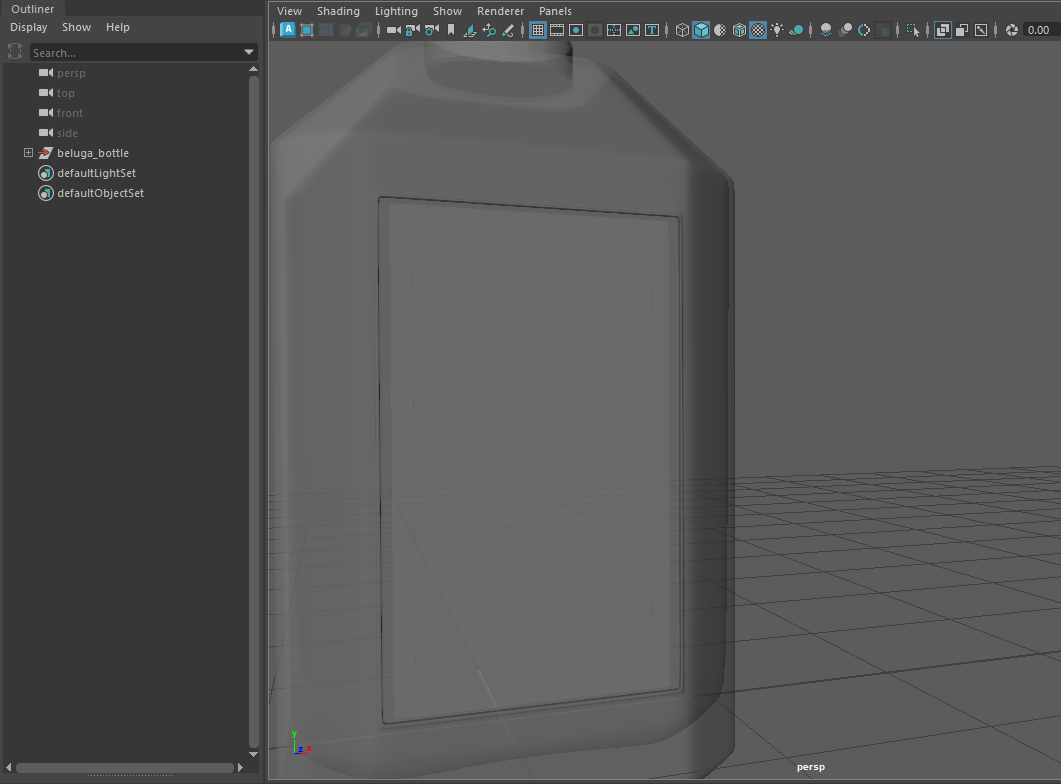
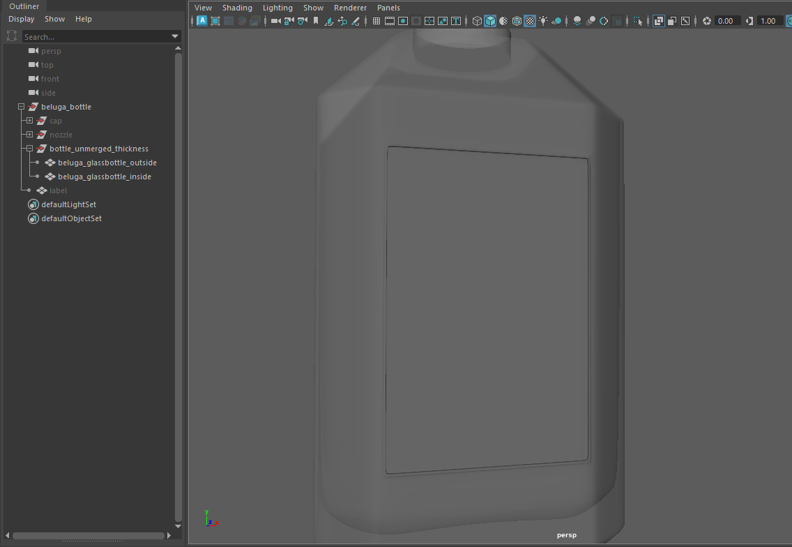
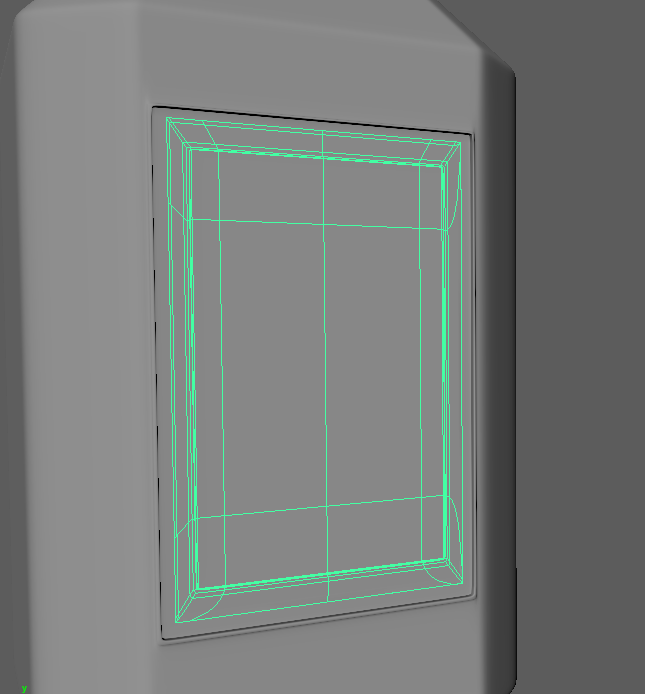
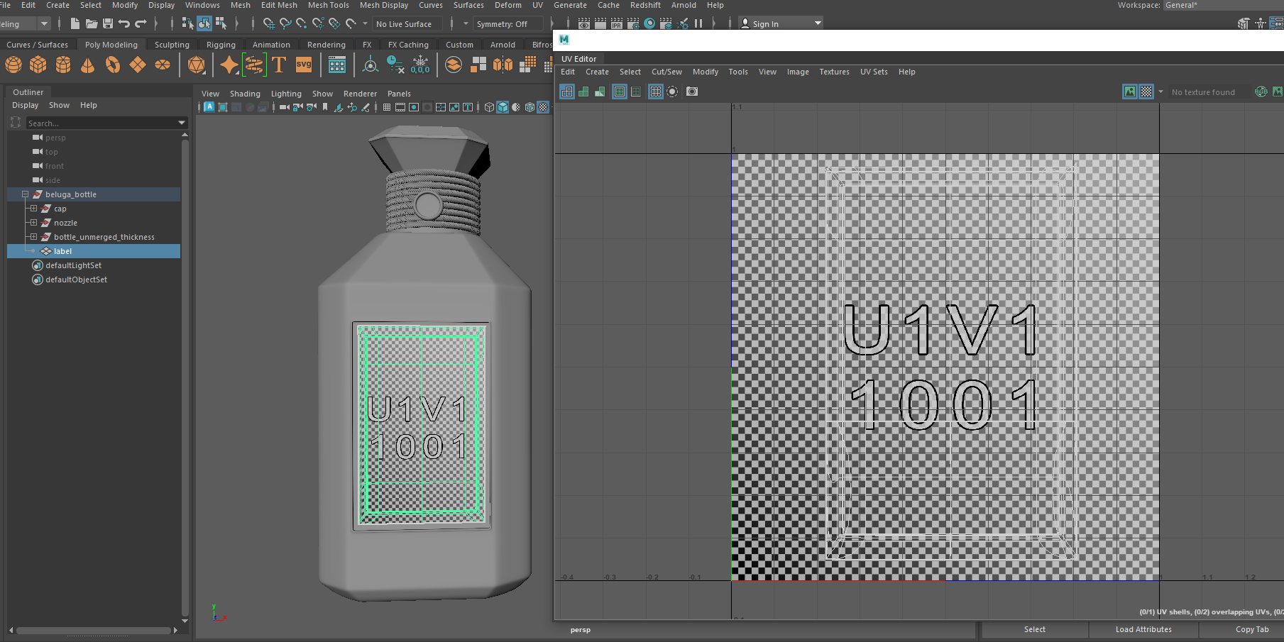
I further examined the details of the bottle and realized I was missing a detail on the front of the bottle where the label would go. There was a rectangular border around the label that seemed to be part of the bottle itself so I wanted to make sure add this detail as soon as possible since that could again affect the look development. I worked on adding this detail along with creating a plane which also had a rectangular border for the label as well. I then passed these off to Emma and worked with her closely to make the look development process as smooth and fast as possible.
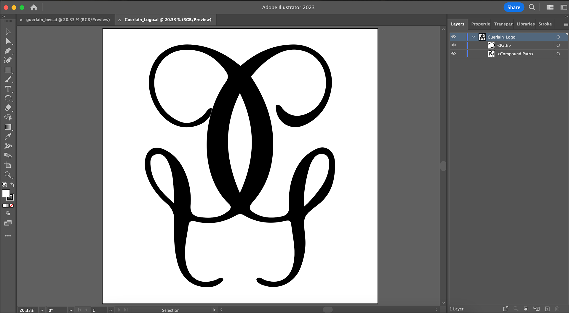
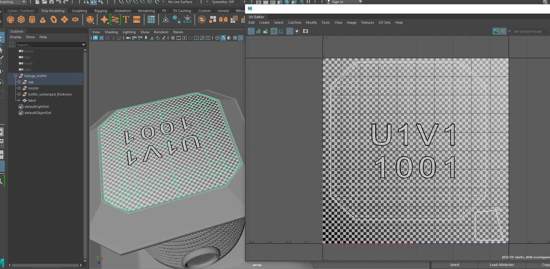
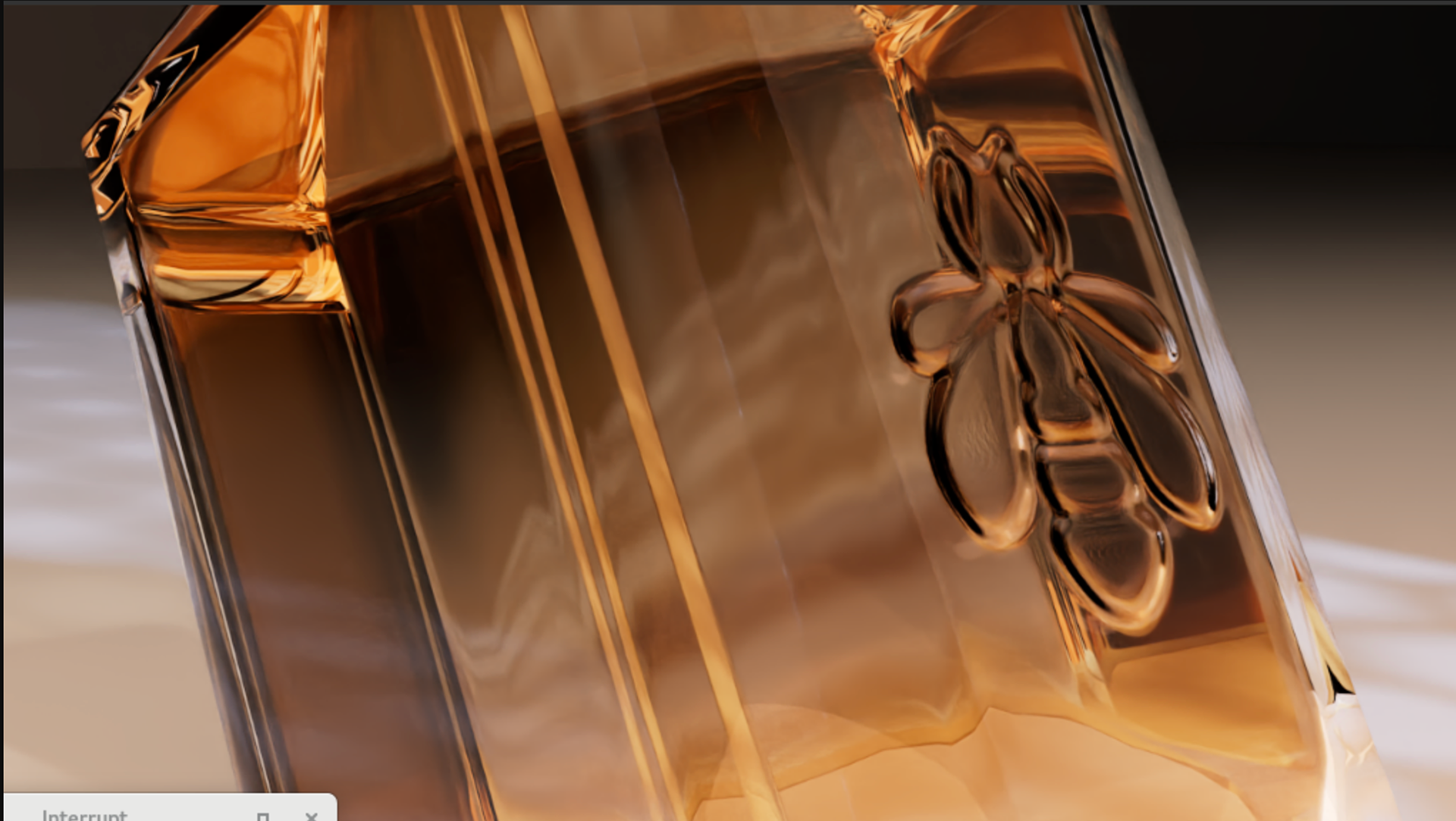
After updating the detail I continued to work on studying the other details we would require to make the bottle look as accurate to the design of the real bottle. I looked at the logo designs of the bee embossed at the back of the bottle and the Guerlain logo embossed on the seal of the bottle cap and on top of it. I used references from Guerlain's website and recreated these logos in illustrator.
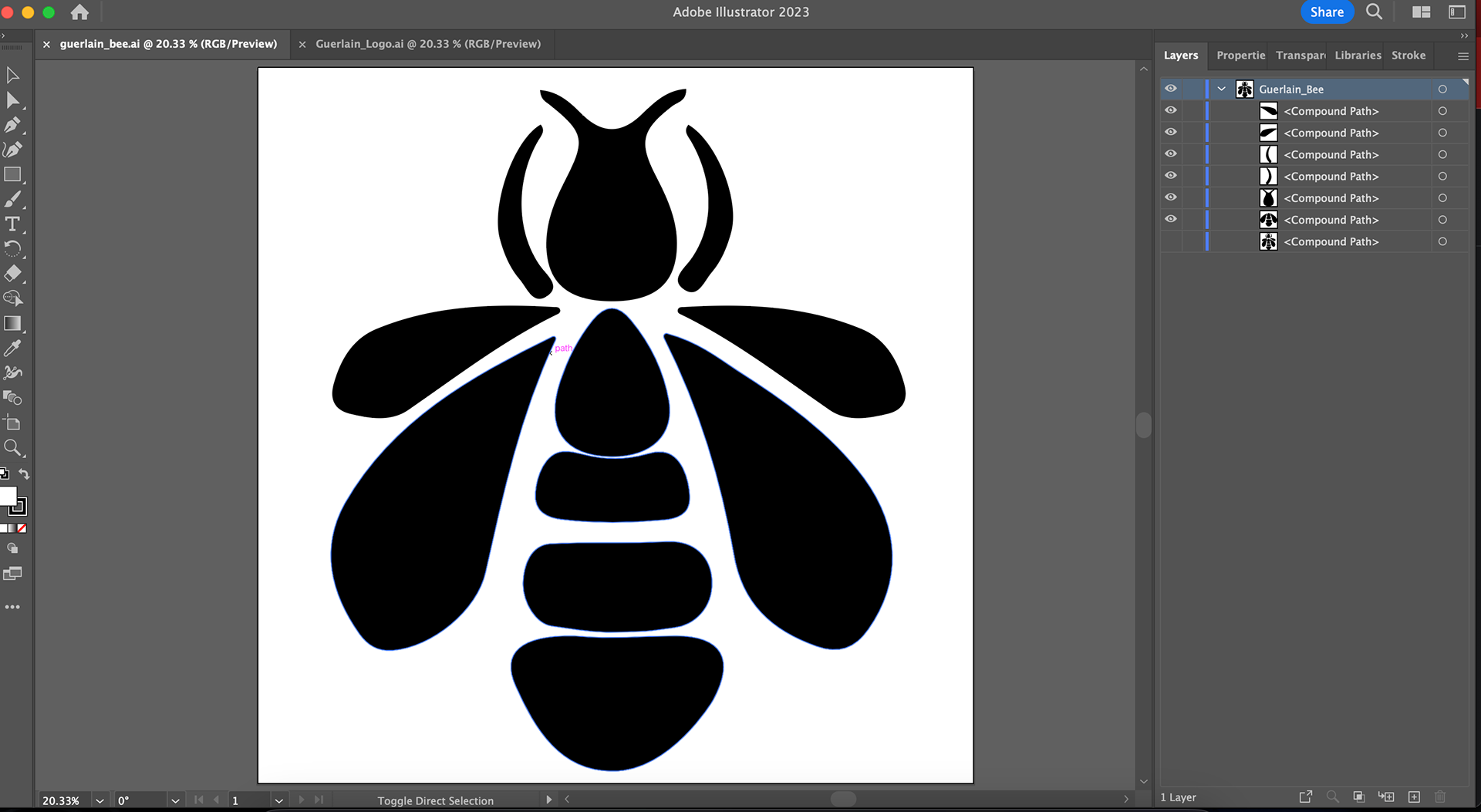
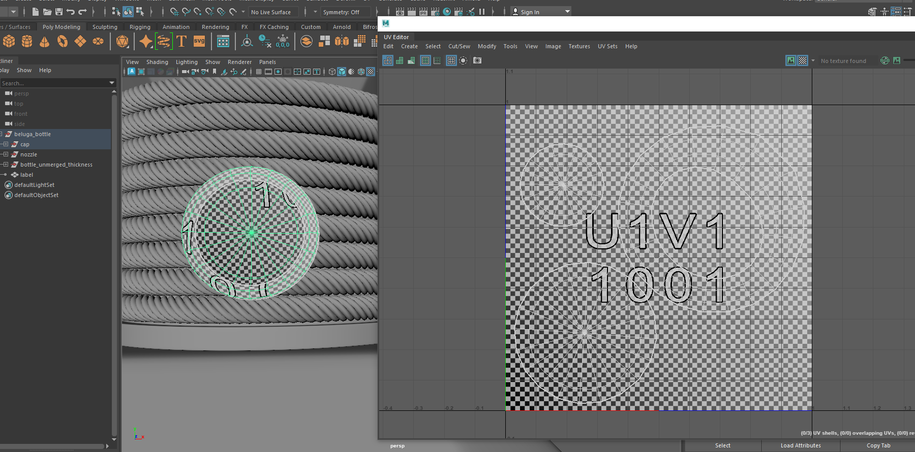
I exported the images to be used for displacement on the glass bottle (bee) and the bottle cap (Guerlain logo). I then worked on UVs for the parts of the model that needed displacement. I then exported out displacement map images which I could pass off to Emma. I also UV-d the label so that Emma can work continue working on the shader of the glass with the label in front of the bottle. I wanted to add as many details on as early as possible so that we can troubleshoot any issues with look development as early as possible.
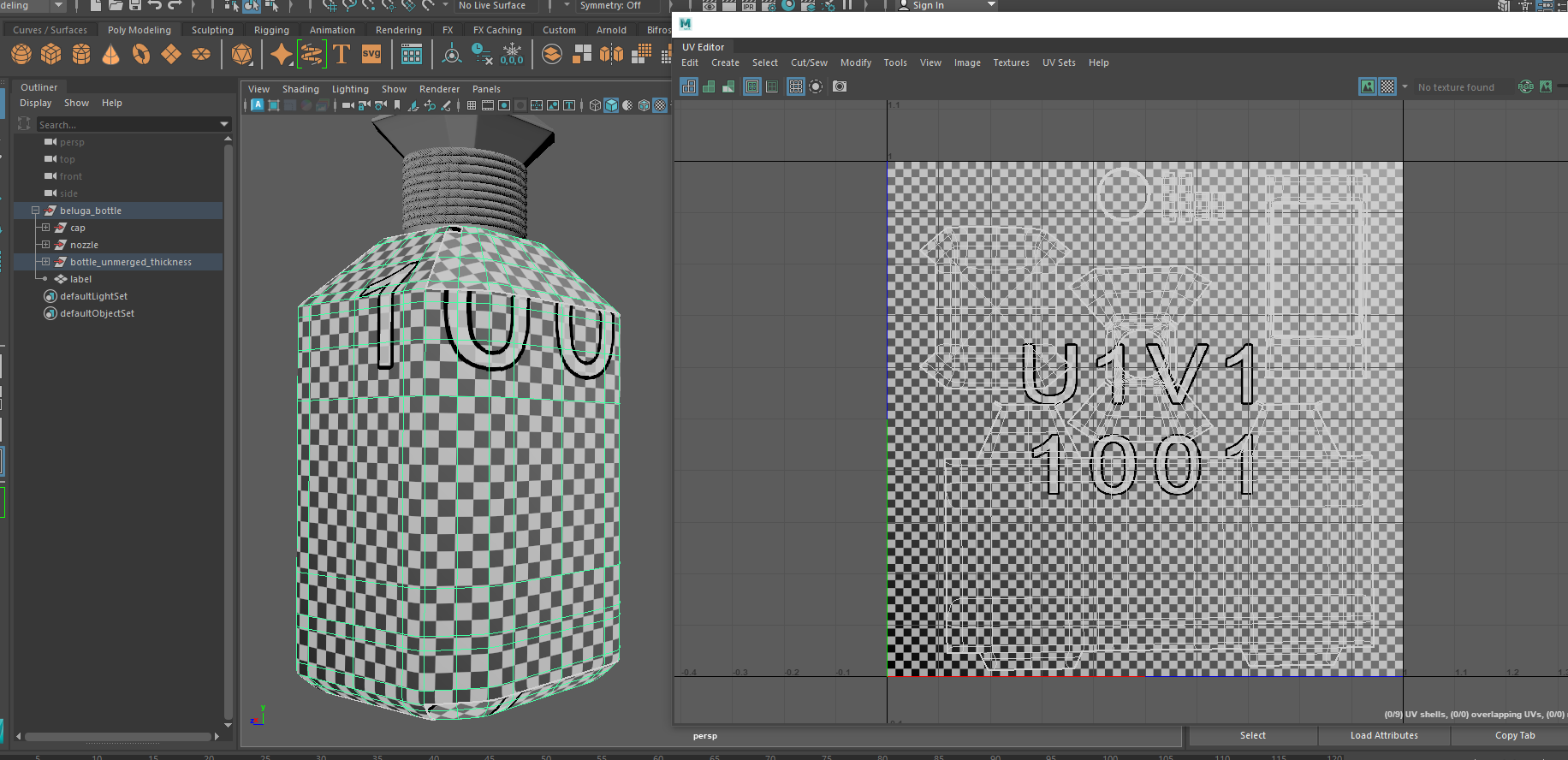
As expected there were a few more issues with the curvature of the inside portion the bottle not looking correct and it took us some time to understand how displacement works within Red Shift. I made changes to the inside bottle curvature and passed that detail to Emma so she could update it and confirm if the detail was starting to look correct.

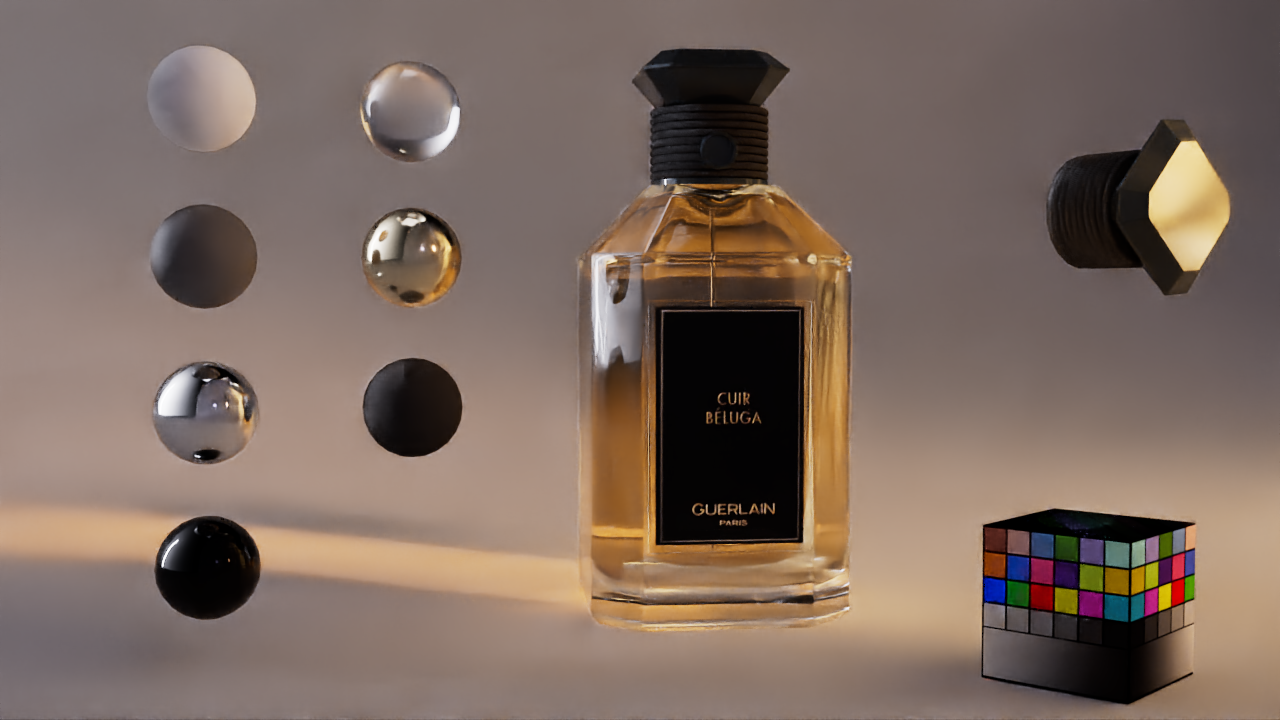
The next issue that needed fixing was the displacement, the displacement map was not affecting the geometry at all initially. We tested out the displacement map and it seemed to be in the correct place and was not distorted. Which confirmed that the UV and displacement map were both correct. Emma quickly did some more troubleshooting and asked if I could change the displacement map file format from tif to png. I made the change and we tested out the new map. This change made a difference and we started seeing the displacement happening on the glass.
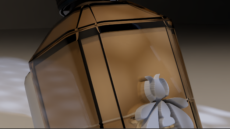

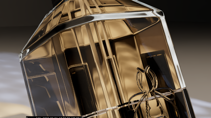
The next issue we were facing is the way the displacement map affected the look of the shader and the map itself not looking quite right. After more troubleshooting, Emma was able to fix any issues with the way the glass shader looked. She then talked to our other team member Galina and she suggested blurring the displacement map to get a softer edge on the displacement. This made a huge difference and the bee was starting to look correctly displaced on the glass bottle.
This week was a true collaboration between my teammate and I. As a result, we were able to push the look development a lot further and the perfume bottle is starting to look more accurate to the original design.
We are excited to continue working on the look development next week and polish the look as much as possible.
Below is our first pass of the composite where we pushed the look development and FX as far as possible.